

One internal tool,
no third-party SDKs.
no third-party SDKs.
Ourora Core is the in-house workspace where we run tasks, bugs, releases, analytics and feedback, so product and user data stay inside our own stack.
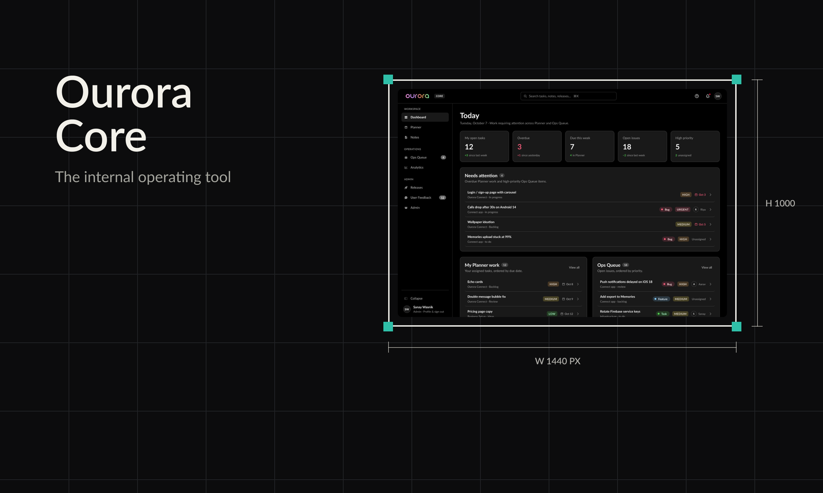

A privacy-first company needs its own tools
Ourora is privacy-first. We share as little data with third parties as we can, and today that list is three names: Google, Apple and Agora. Everything else has to be first-party.
That rule has a cost. A small team still needs task management, documentation, bug reports, releases, analytics, user feedback and admin. The usual answer is a SaaS tool for each, or another SDK in the app. Not being able to reach for those, and not trusting SDKs that may or may not be safe, was real friction.
Ourora Core is the other answer: one internal tool that does all of it. I am co-founder and product designer at Ourora, and I have also done engineering on the product, so I designed Core knowing who would have to build and maintain it.
- Brief: one in-house workspace for planning, docs, bug reports, releases, analytics, user feedback and admin.
- Sign-in is Google Workspace only. There is no sign-up and no public surface.
- Every module sits on Duet Web, the web layer of Ourora's design system.
The trade-off
A tool or SDK per job
- Product and user data spread across vendors
- Each new SDK is another party to trust
- Every tool has its own patterns and logins
One first-party workspace
- Data stays in our own stack
- Only Google, Apple and Agora see any data
- One shell, one design system, one sign-in
Starting from the live tool
Core already existed as a working frontend, so the research was an audit of it rather than interviews. I went through the live screens and noted what a team of our size trips over.
Three problems came up repeatedly, and each one became a principle for the redesign.
Audit findings
| What I found | Why it hurt | What the redesign does |
|---|---|---|
| Surfaces looked and behaved differently from module to module | Every module had to be re-learned | One app shell and one component set behind every page |
| Controls that did nothing | People stopped trusting the UI | A control ships only if it works; settings that cannot persist yet stay hidden |
| Analytics numbers without events behind them | Plausible numbers that could not be trusted | Cards say Not tracked yet instead of showing a value |
Principles
Decide once, apply everywhere
The shell, overlays and stat cards are designed once and reused by every module.
Say when we don't know
If the app does not report an event, the dashboard says so rather than faking a number.
Status at a glance
Live counts in the sidebar and a Today view show what needs attention without opening each module.
Dense, not cramped
A working tool with many rows, tuned for density while staying legible in dark and light.
Information architecture
I started with the frame, not the screens. Core has one shell: a header with global search (Command-K), help, notifications and profile, and a sidebar grouped the way the team works. Every module is a page inside it.
Workspace holds daily work, Operations holds queues and analytics, Admin holds releases, feedback and access. Ops Queue and User Feedback show live counts, so the sidebar doubles as a small status board.
Sidebar and modules
The redesign, module by module
With the shell fixed I worked module by module. Drawers and dialogs share one header and footer, tables share one row pattern, and every stat strip is the same Stat Card. All data in the screens below is sample data.
Today & planning
What needs me today, and the work behind it.
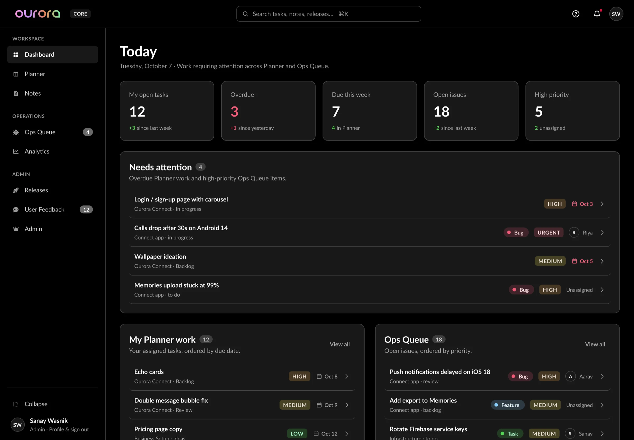
Today: overdue work and urgent issues in one list.
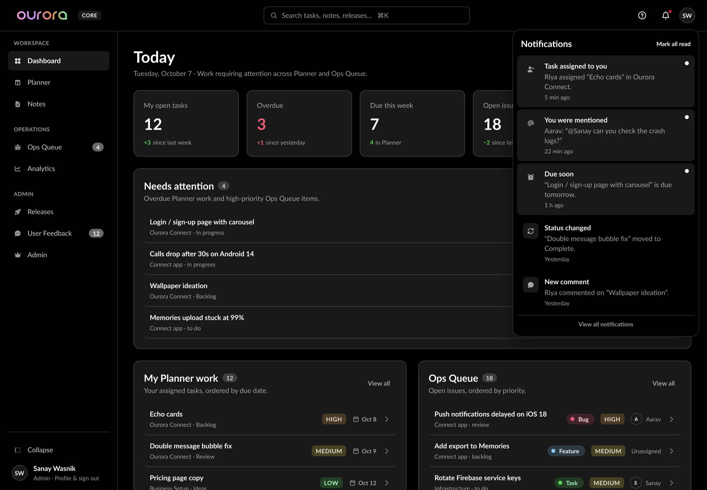
Notifications panel over the dashboard.
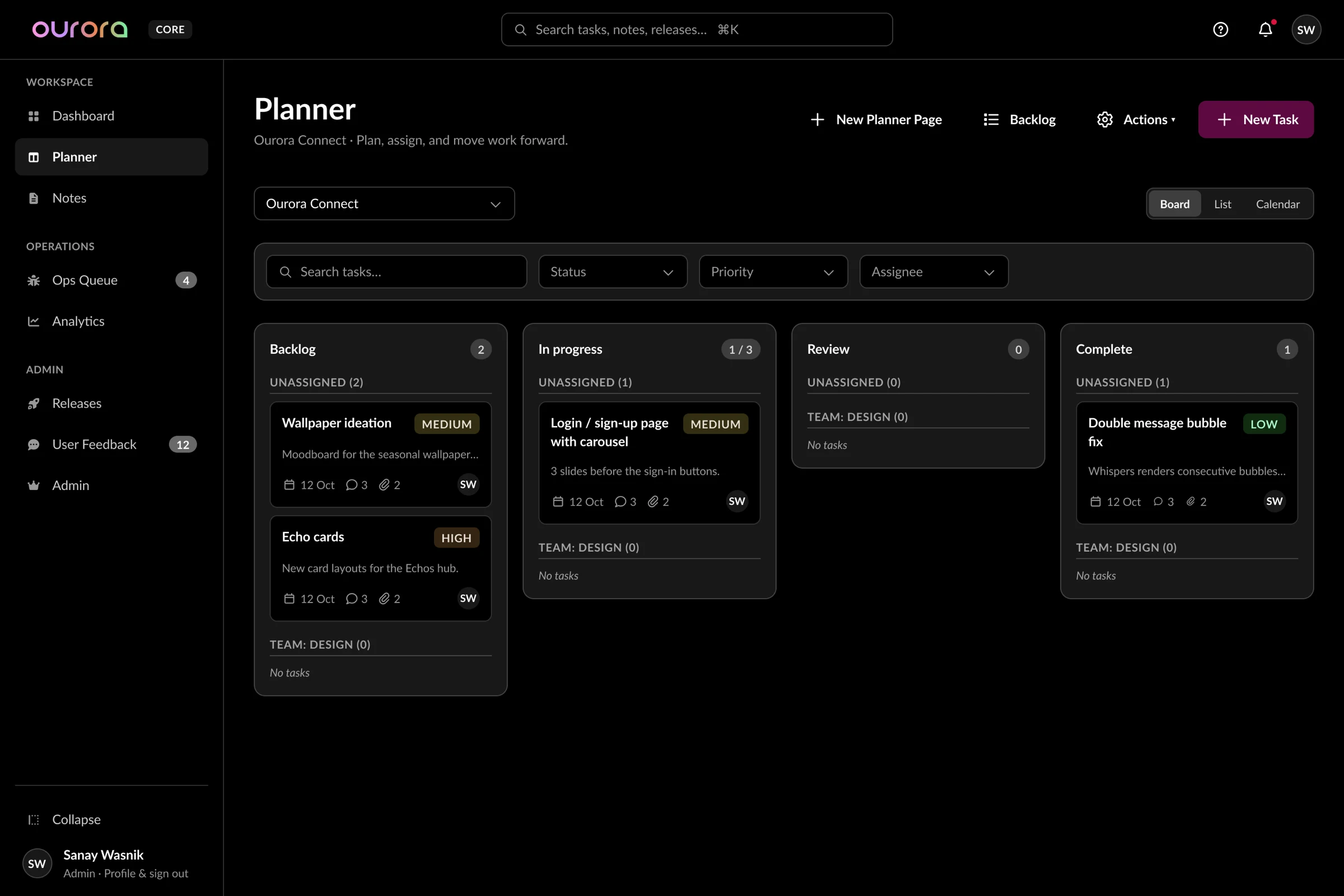
Planner board: WIP shown as count against limit.
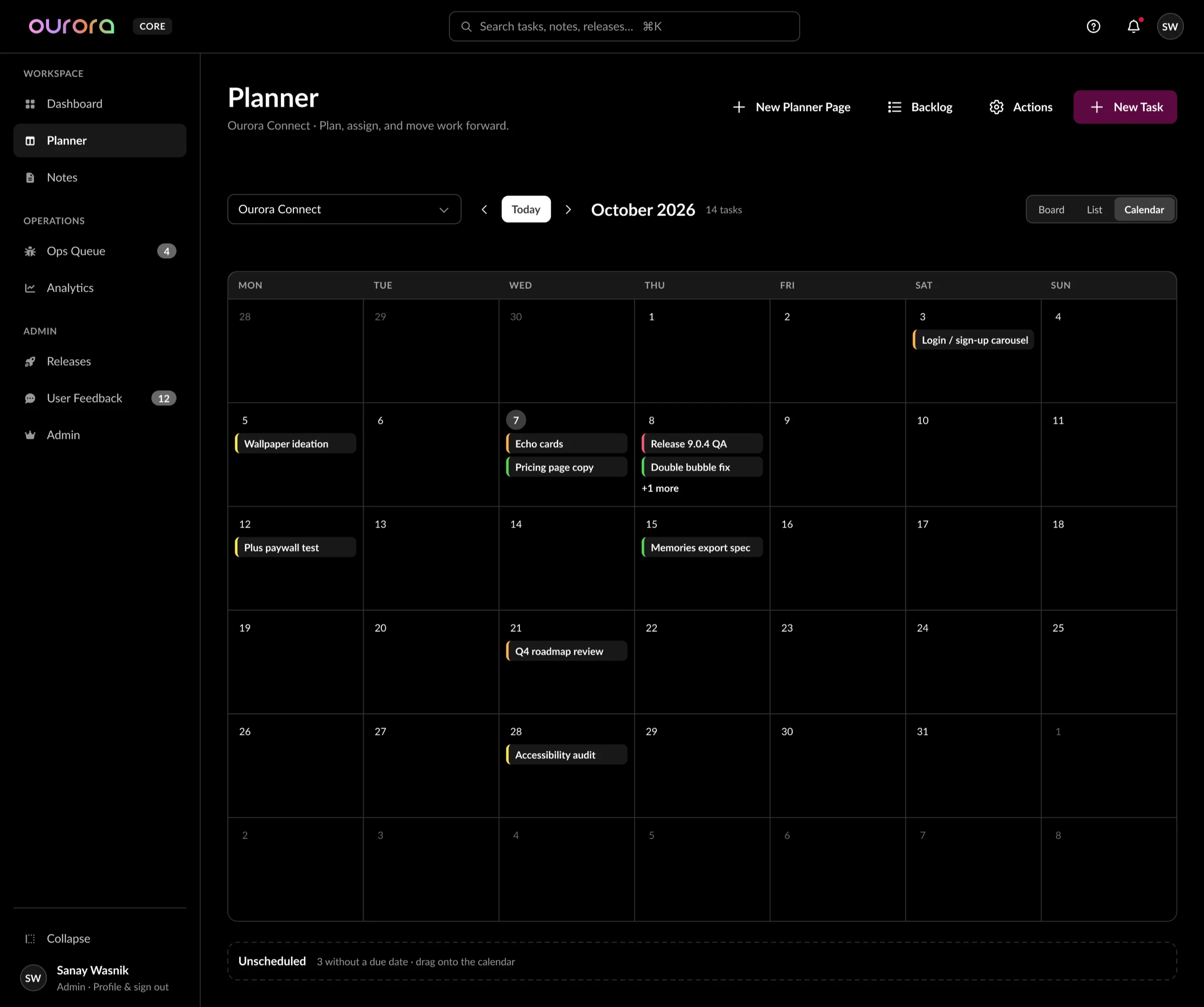
Same tasks, calendar view.
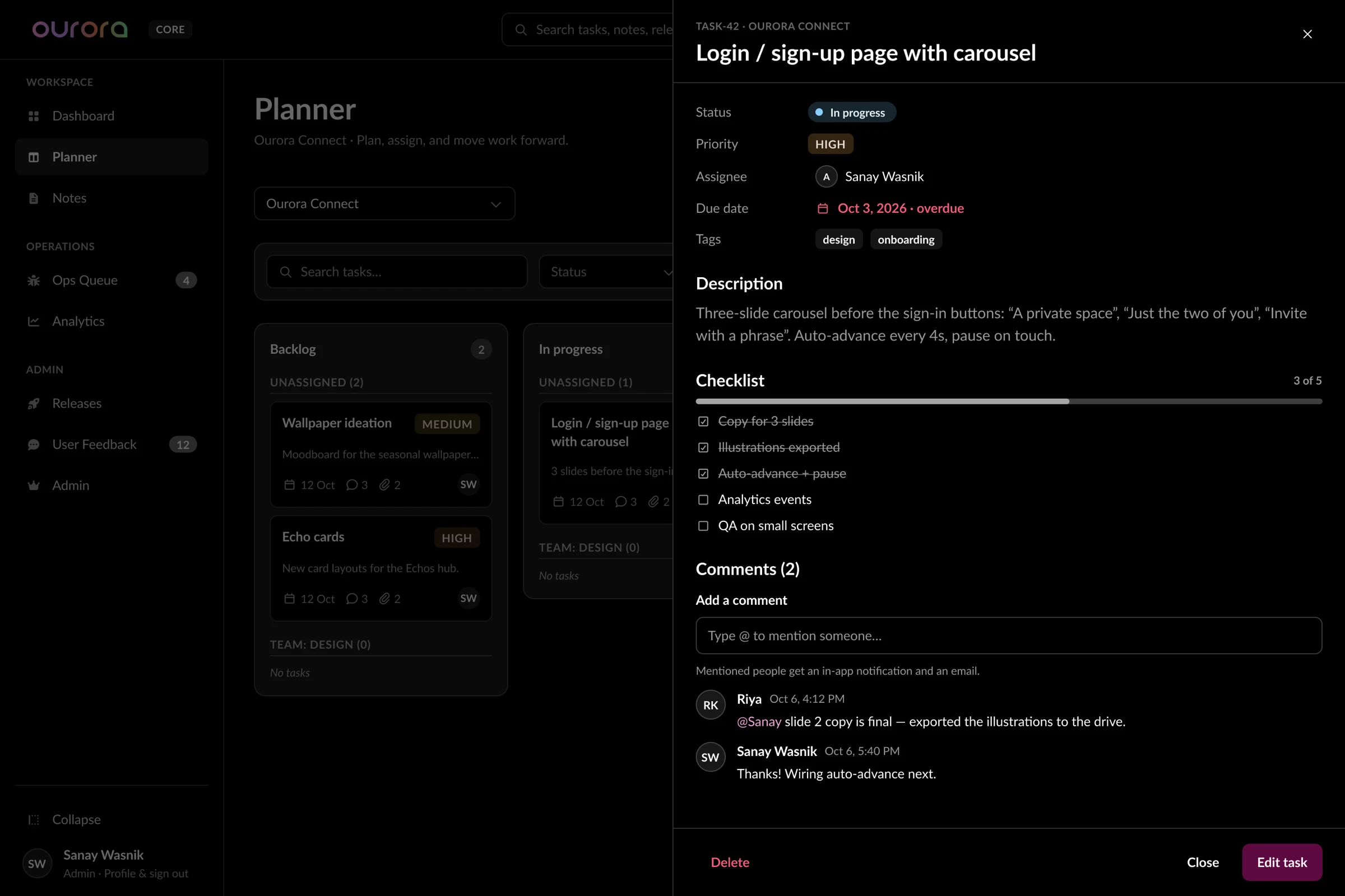
Task drawer with comments and mentions.
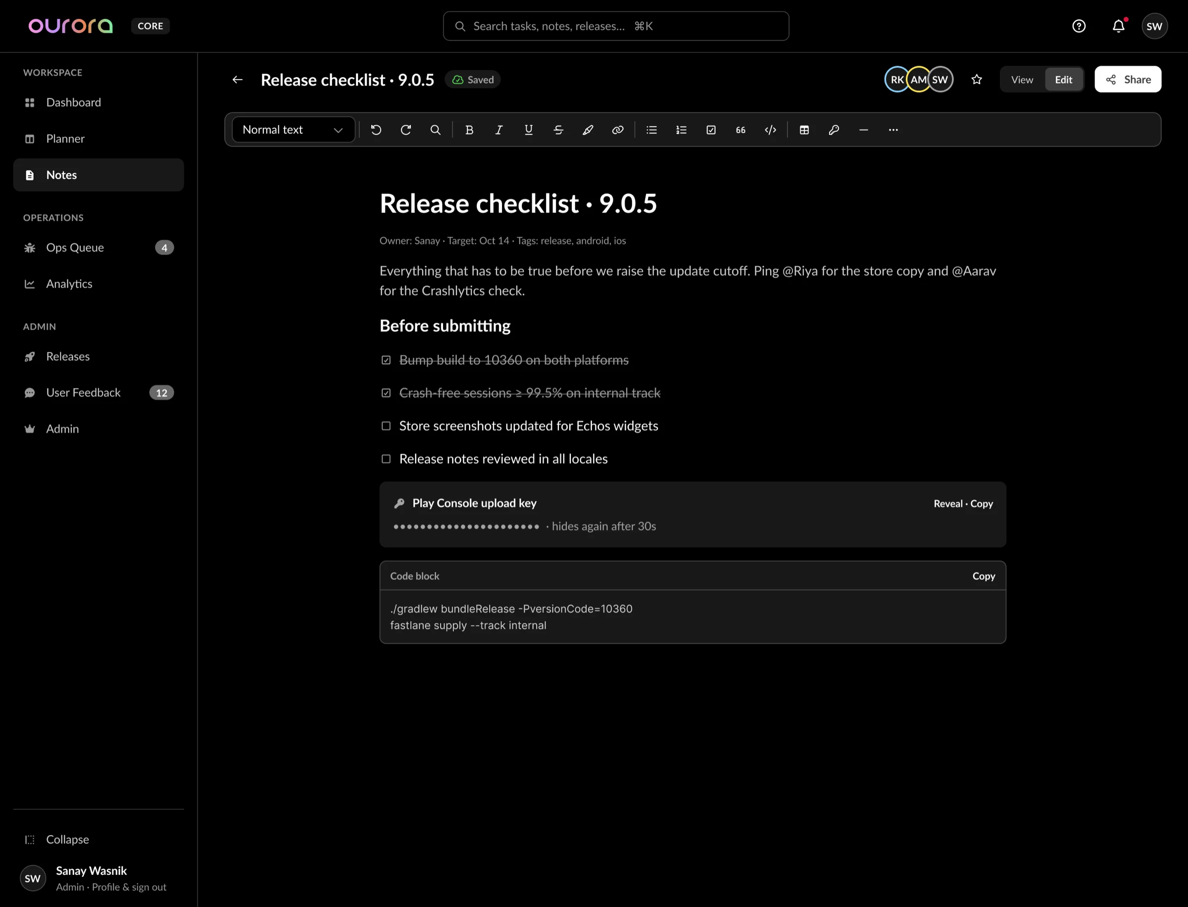
Notes: masked values re-hide after 30 seconds.
Operations
Our own bug and request queue, plus feedback from the app's rating widget.
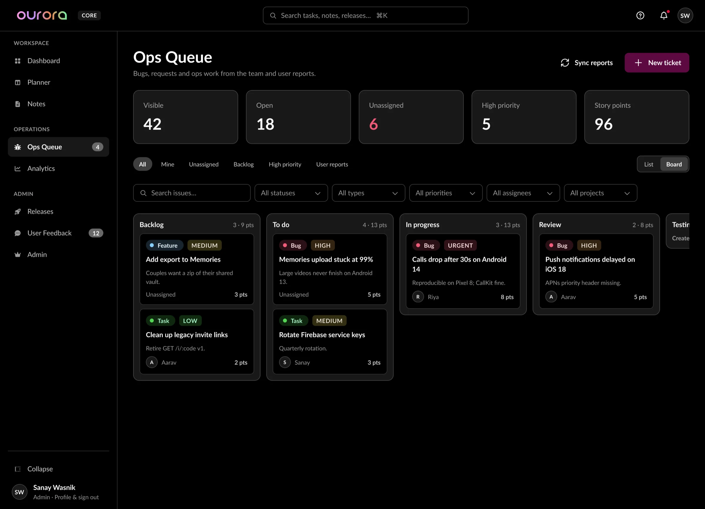
Ops Queue as a board.
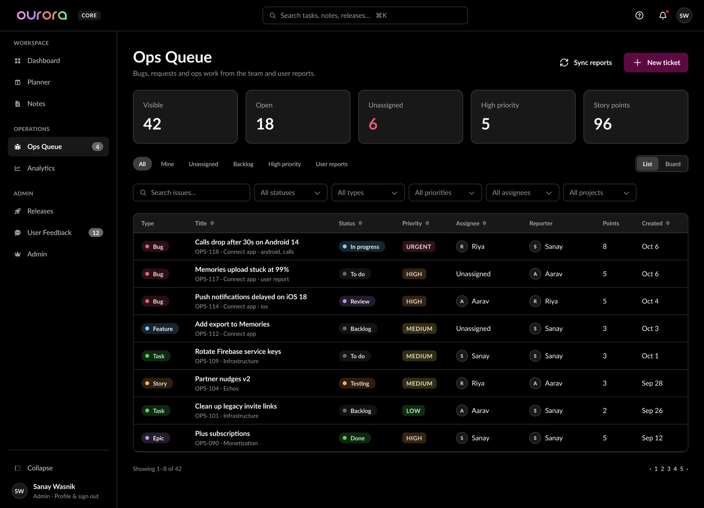
The same queue as a dense list.
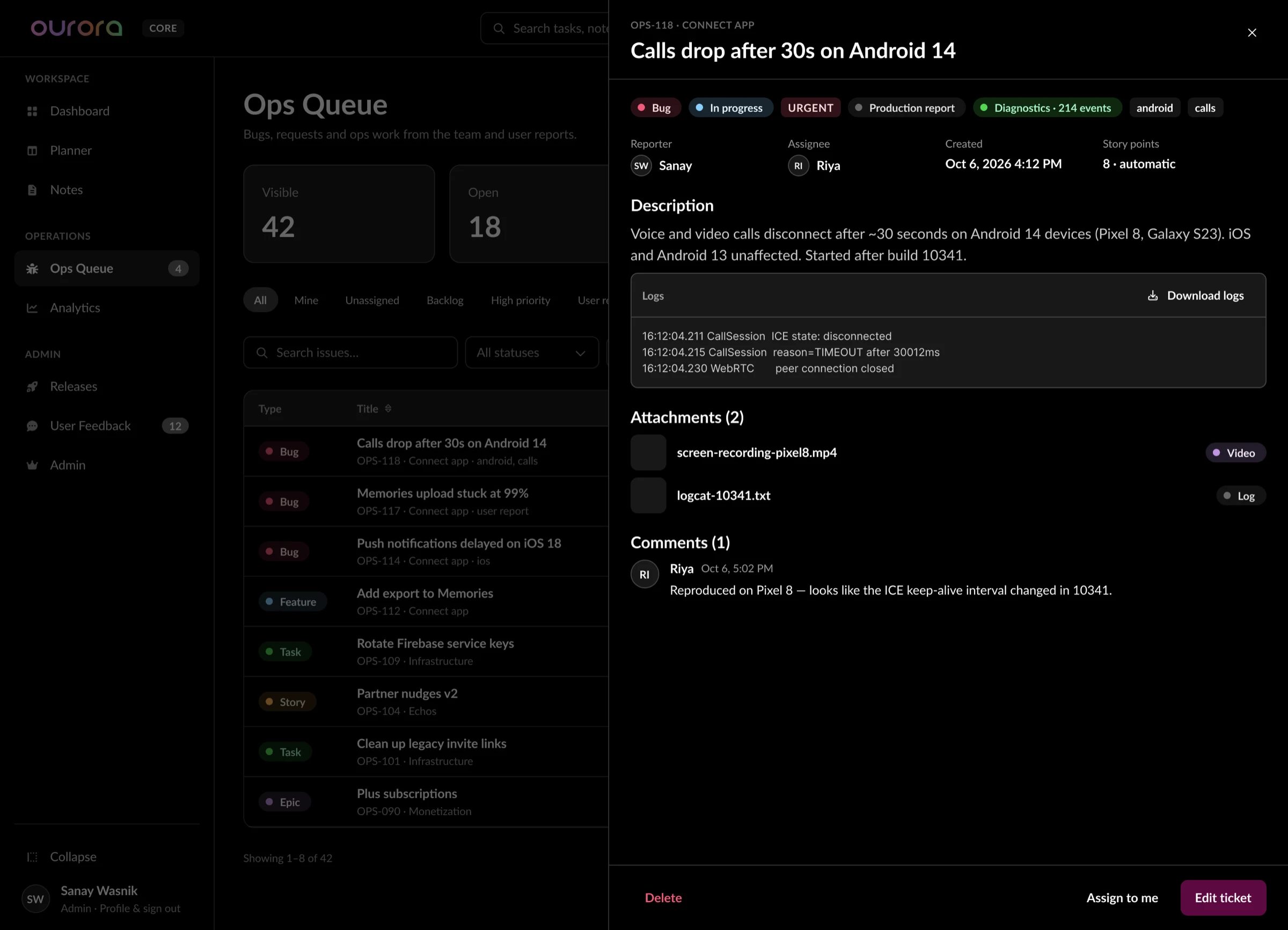
Ticket drawer: logs and diagnostics attached.
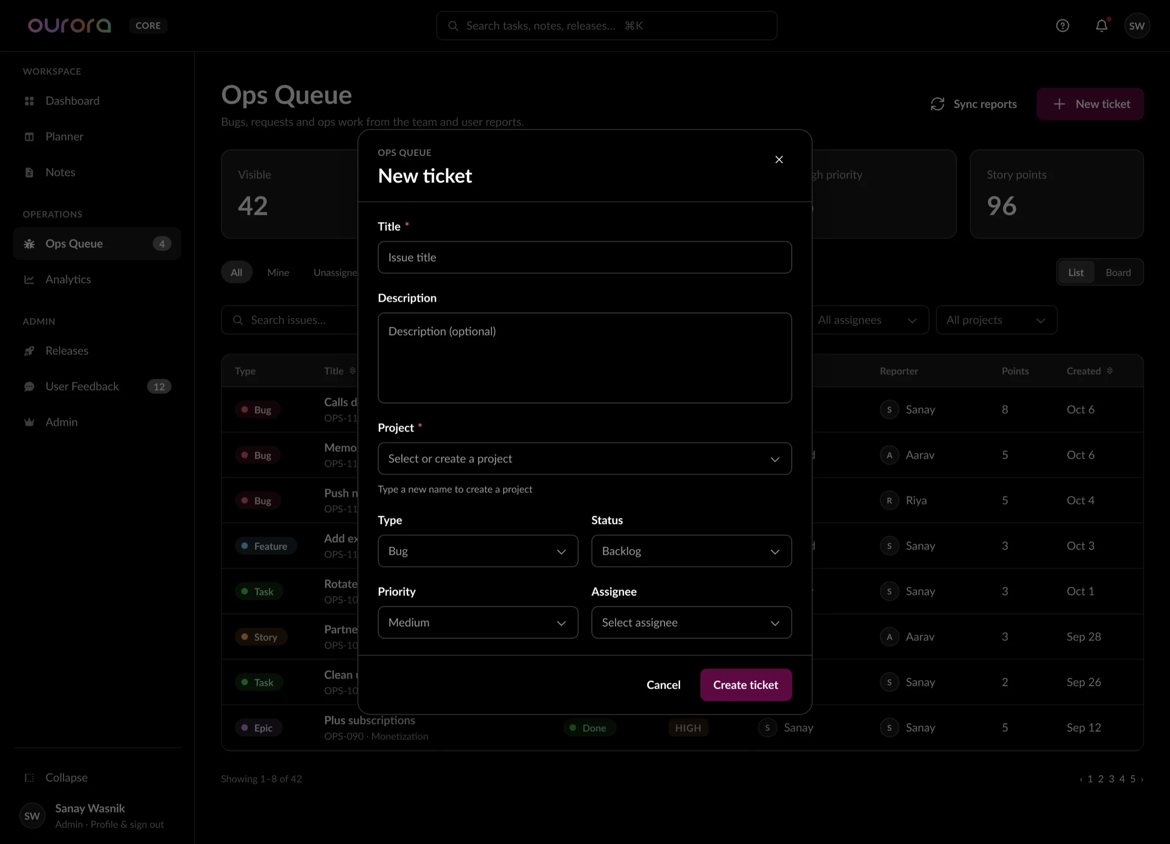
New ticket dialog.
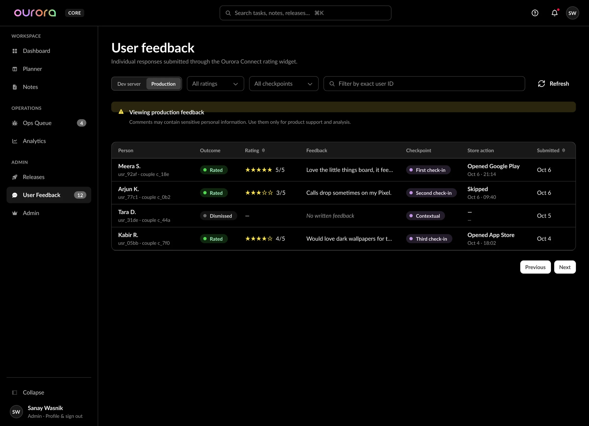
User Feedback with a privacy warning on production.
Insight
First-party analytics, measured per couple, with honest gaps.
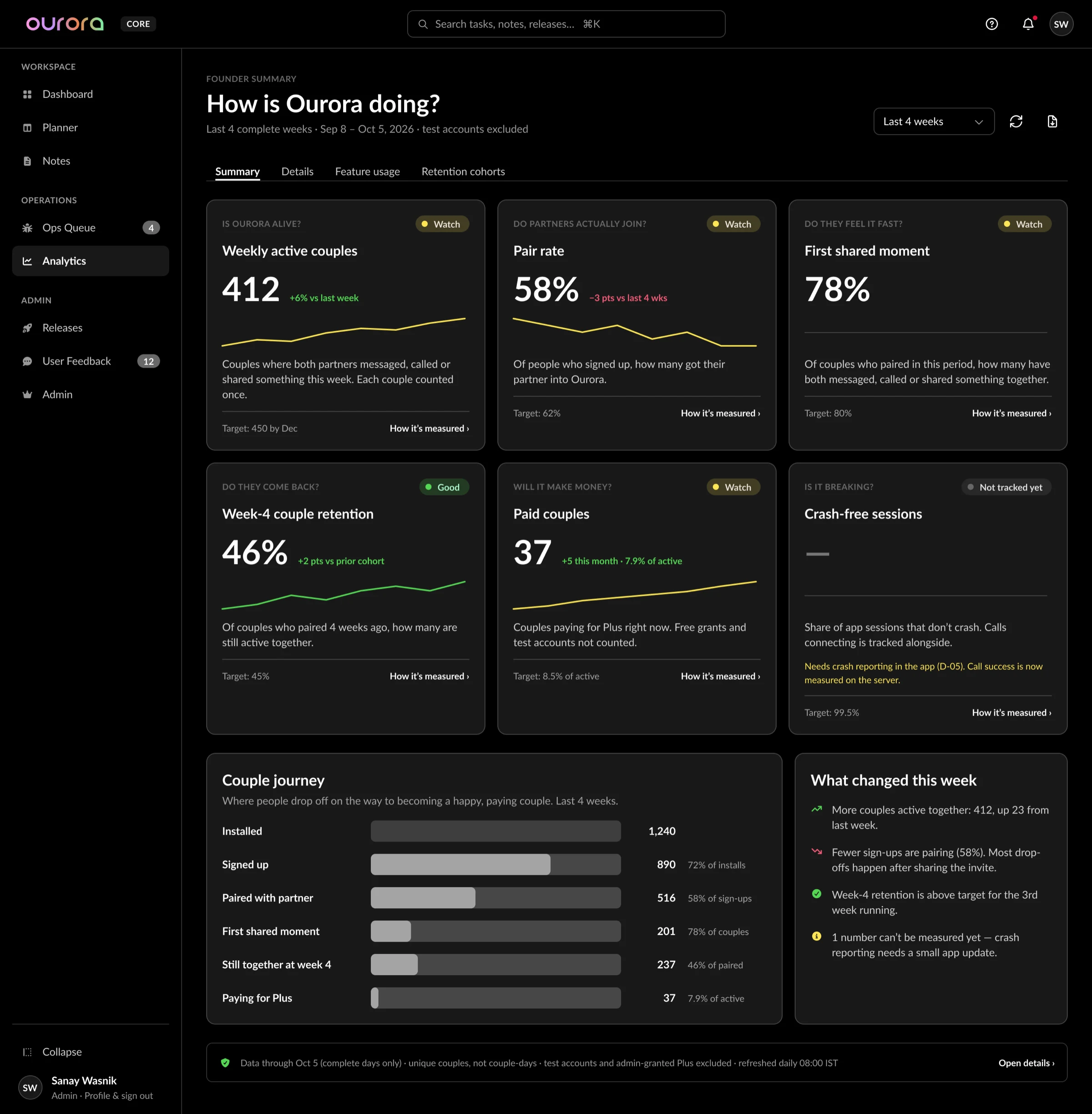
Founder summary: one question per card.
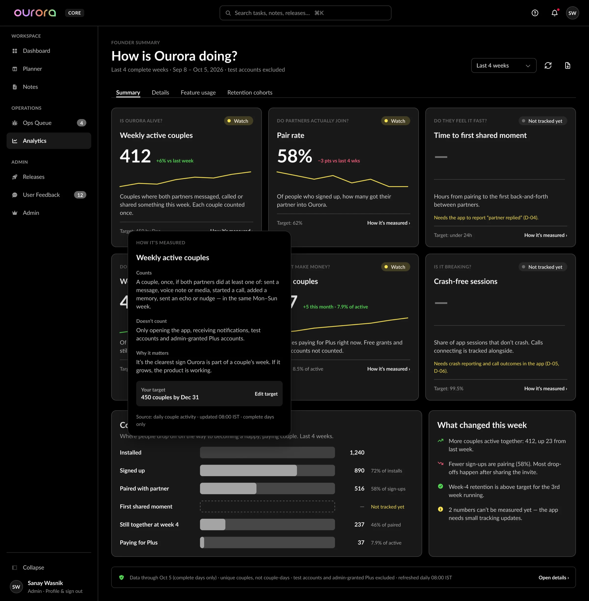
How it's measured: what counts and what doesn't.
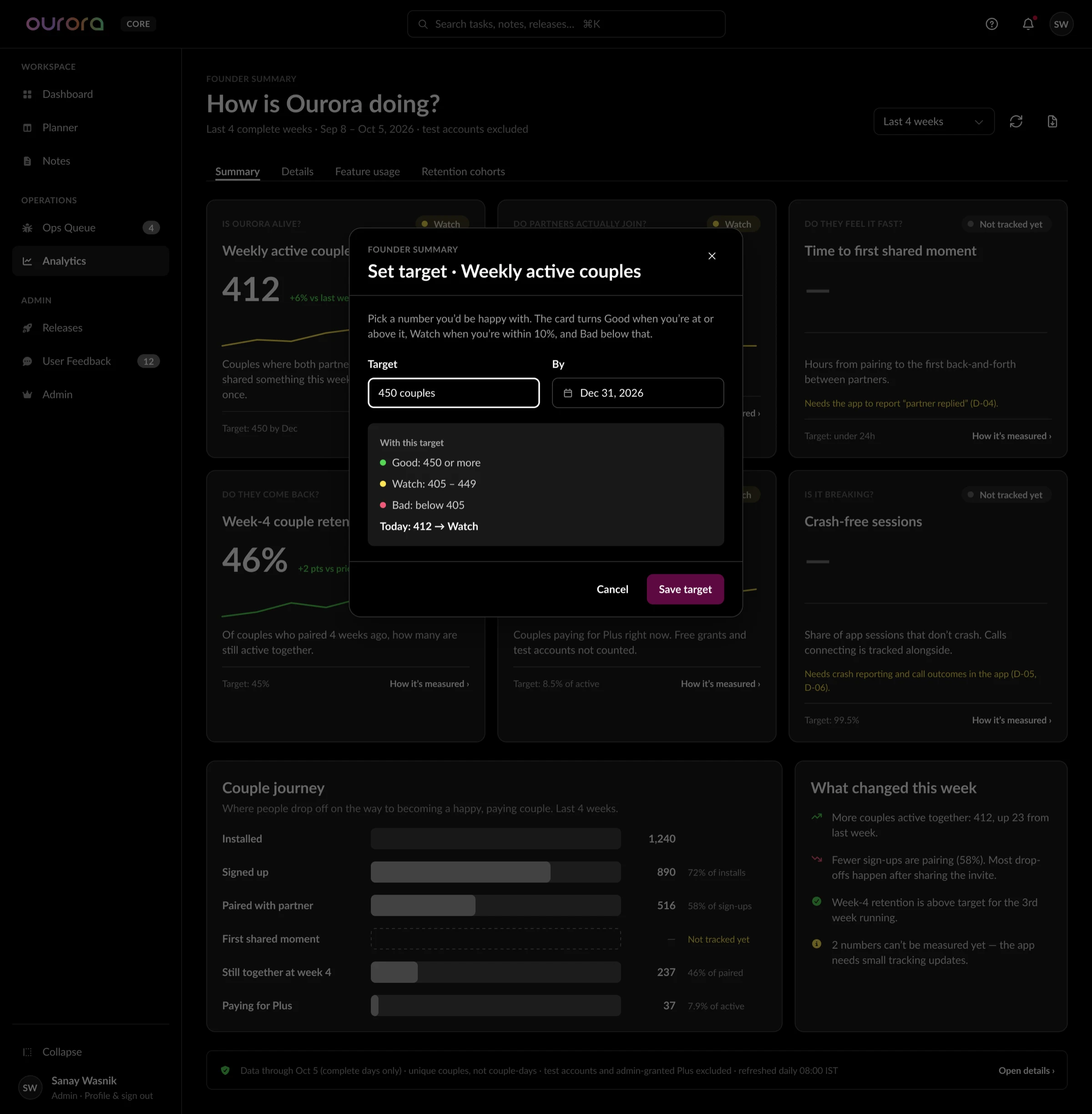
Targets are set by us, not hard-coded.
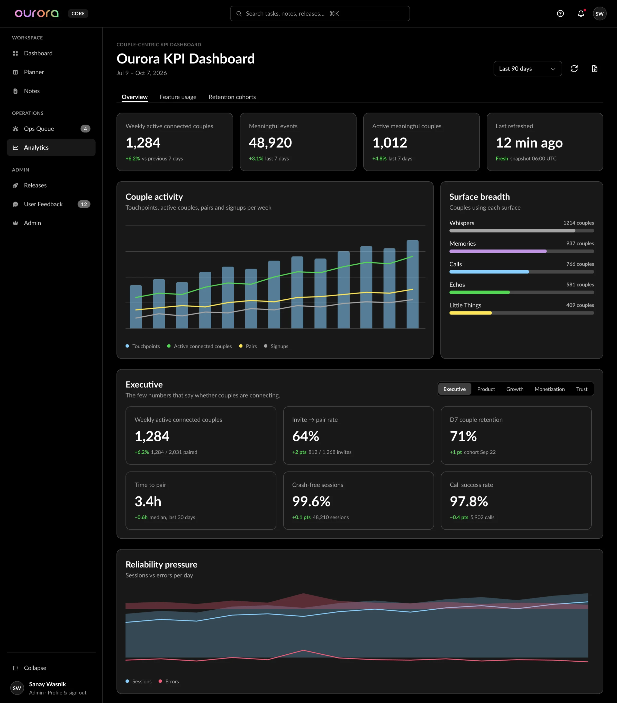
Details: activity, surfaces and reliability.
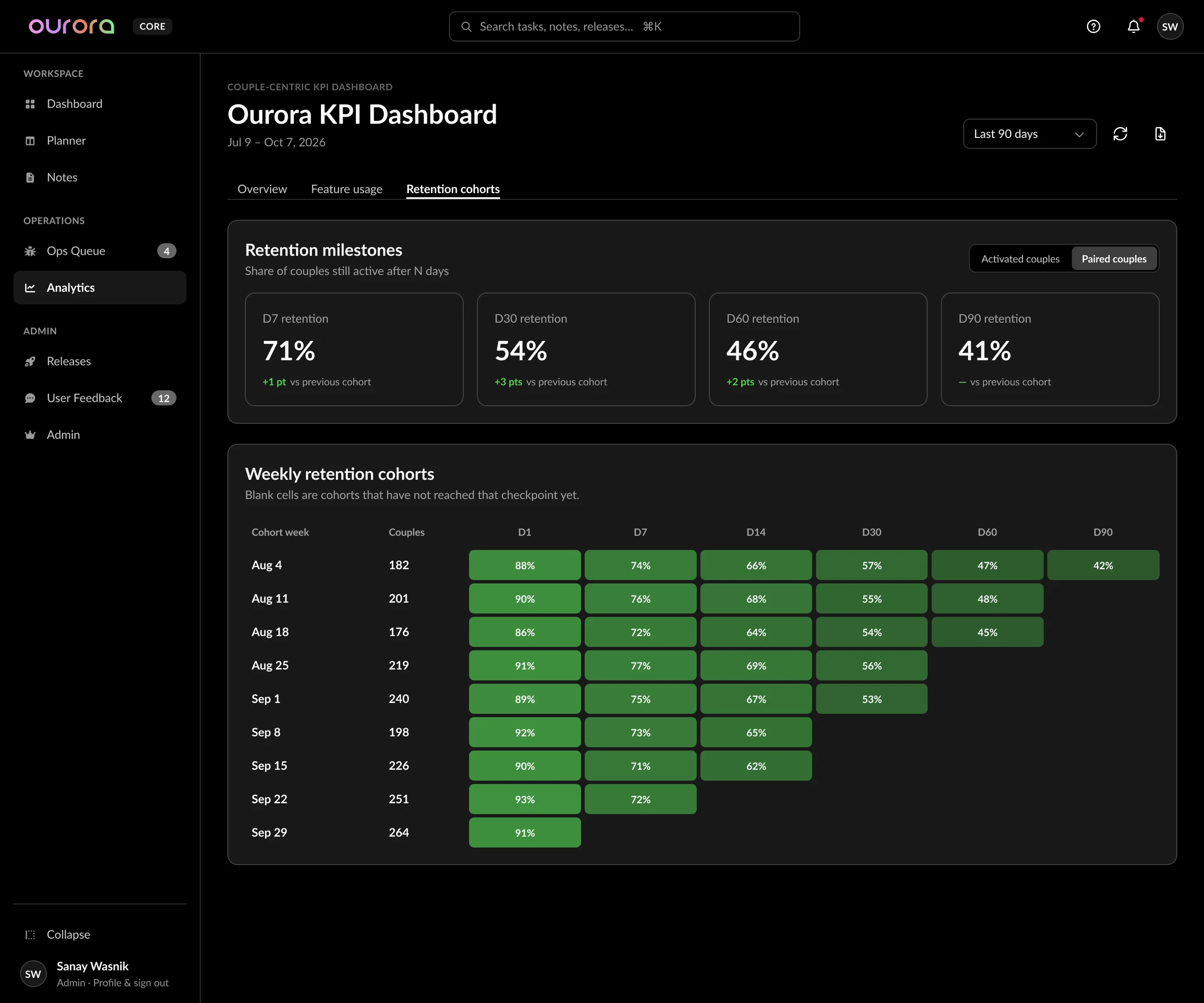
Retention by weekly cohort.
Access
One way in: the company Google Workspace account.
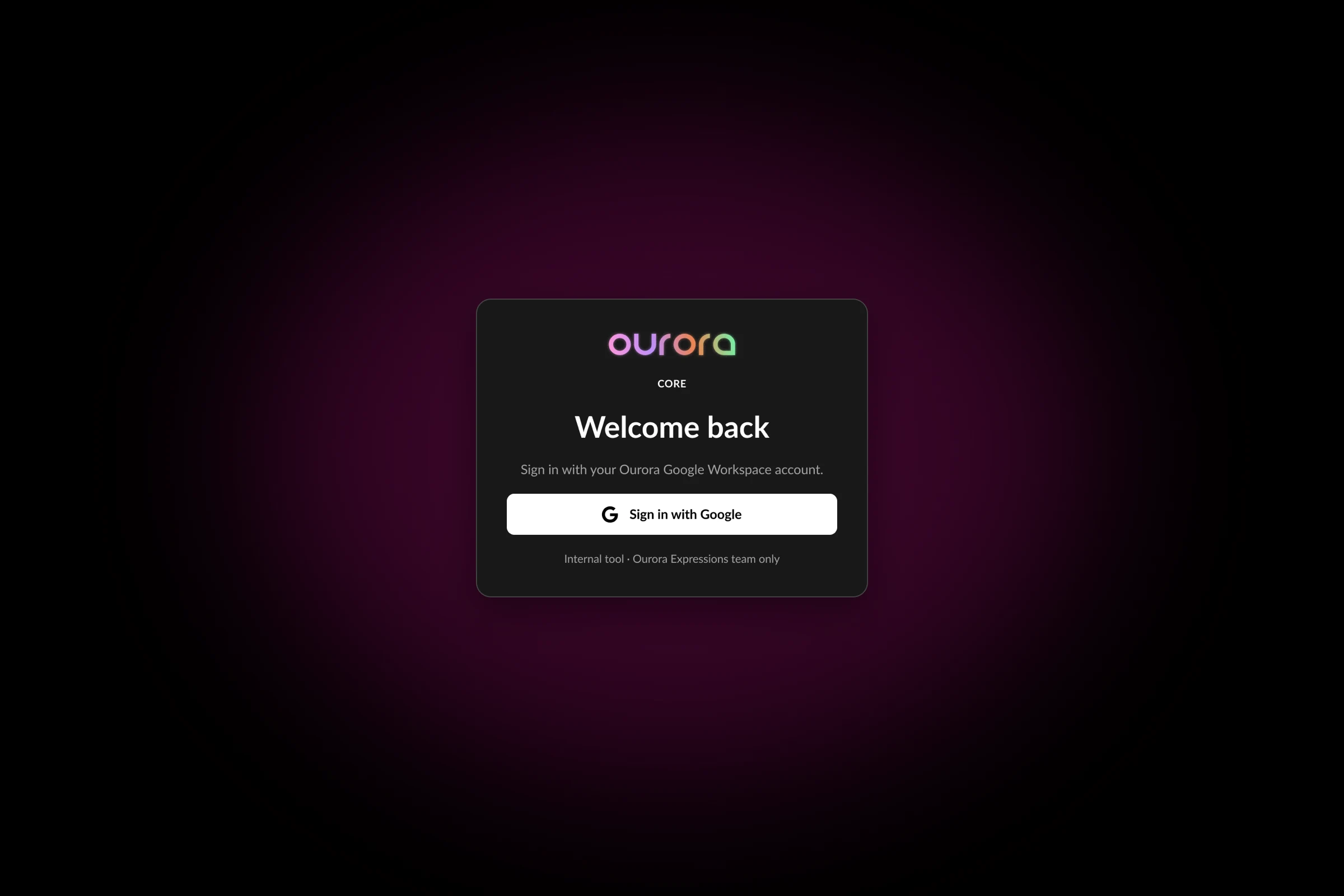
Sign-in: Google Workspace only.
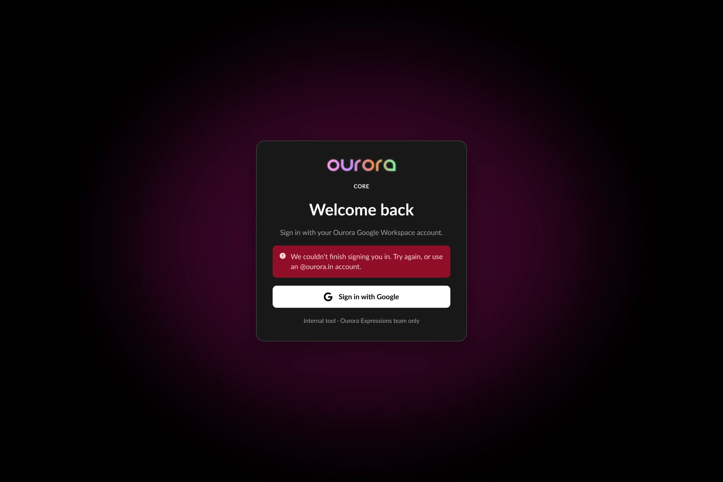
Error state with a clear next step.
Built on Duet Web, not styled from scratch
Core is built on Duet Web, Ourora's web design system. It uses the Duet colours from the Ourora app as-is, with the same names and Dark and Light modes, so the internal tool and the product share one visual language. Dark is the default.
The rules are strict: if Duet has a colour, icon, button, avatar or input, use it; colours are variables, never hex; every padding, gap and radius is a token. Priority chips use the 100 step for text and the 50 step for border and accent bar, so they read in both modes.
The components exist to remove inconsistency. One Stat Card replaces the different stat strips on Dashboard, Queue, Admin, Profile and Analytics. One Status Badge covers queue types and statuses. Duet Web went from v0.1 to v0.4 in two days while the screens were being designed.
Colour, type and components
Values as resolved in Duet's Dark mode. Type is Lato.
Tokens
| Group | Values |
|---|---|
| Space | 0, 2, 4, 8, 12, 16, 20, 24, 32, 40, 48, 64, 80, 96, 128, 160 |
| Radius | none 0 · xs 4 · sm 6 · md 8 · lg 12 · xl 16 · 2xl 24 · full |
| Translucent | TB 25/50/75/100 = white at 20/40/60/80% for hairlines, disabled, supporting and secondary text |
Where it stands
As of October 2026 the redesign is specified: ten modules on one shell and one component set, with the analytics decisions written down for build. Nothing is counted as shipped until it is built.
I am not putting adoption numbers or time savings here, because there are none to stand behind yet. What the design commits to: product and user data stay in our own stack, the interface says when it does not know something, and one system keeps the whole tool consistent.
Some Founder summary KPIs, such as crash-free sessions, need events from the app before they can show a real number. Until then they read Not tracked yet.