

One workflow for a fundraising
team that ran on five tools
team that ran on five tools
I designed a role-aware workflow platform for a major international financial institution, replacing a chain of five disconnected tools with one case view that keeps every contributor, message and status in the same place.

Raising concessional finance across five disconnected tools
A major international financial institution raises concessional financing from its member countries. A small team does that work, and it is audited and carries the institution's name. When I joined, one contribution round moved through a legacy database, a spreadsheet, an email client, a word processor and a document archive. Every hand-off between them was manual: re-keying, screenshots, PDFs split by hand, folders standing in for status.
The lifecycle has five phases, and administration can run for years after signing, so milestones, reporting duties and amendments needed the same visibility as the first ask. Four roles share it, each with a different job and a different pain.
I was the sole designer for five months, working with a delivery team. The product was built on a low-code enterprise suite, so the default interface had to be reshaped rather than replaced.
- No shared view of what was sent, to whom, or what was still pending
- History held in people's heads and in folder names
- Manual control was a deliberate risk strategy and had to be preserved
- Email client and document archive stay in the loop as integrations
One lifecycle, five phases
Every contributor case moves through the same phases. The last one can last for years.
- AskSet targets by resource type and send the ask package
- PledgeTrack who has responded, pledged or gone quiet
- NegotiateHandle terms and exceptions case by case
- FinaliseConfirm figures and agreement readiness
- AdministerMilestones, reporting duties and amendments over years
Five tools became one workflow
A chain of five tools
- Legacy database for contact and contributor data
- Master spreadsheet for the numbers
- Email client for every ask, reminder and reply
- Word processor and PDF tools for mail-merge and splitting by hand
- Document archive folders standing in for status
One case view per contributor
- One record with change history and an owner
- Explicit states: draft, ready, sent, archived
- Drafts generated, then reviewed and certified by a person
- Validation before anything is sent
- Email and archive kept as integrations, not hand-offs
Interviews showed that control is a feature, not a habit
I ran 12 interviews across the four roles and mapped each current workflow end to end. From them I built four personas and empathy maps, then eight journey maps covering today and the intended future state. The pattern was the same in every role: careful, accuracy-first people holding a long lifecycle together with memory, folders and copy-paste.
Those people distrust silent automation, and with good reason. Double and triple checking is how they protect the institution from costly mistakes. So I stopped treating manual control as a habit to remove. The design bar became automation with guardrails: generate a draft, then let a person review, certify and send it, with state and sources always visible.
Four roles, one lifecycle
Role titles are generalised; the content is paraphrased from the synthesis.
Programme Coordinator
Be completely sure every communication is correct before it leaves.
- Keeps the contact database up to date
- Customises recipients and content for each send
- Mail-merges, converts to PDF and splits files by hand
- Archives every send
- Error-prone manual steps
- Complex multi-country sends
- No visibility of what was sent or answered
- Validation before send
- Clear send and track status
- Centralised contact data
Finance Officer
Carry each contributor case accurately across a lifecycle that lasts years.
- Tracks asks, pledges and agreements by hand
- Reconciles data across sources
- Drafts agreements over email
- Sets personal reminders for key dates
- No end-to-end view of a case
- History rebuilt from memory
- Heavy reconciliation
- One trusted case view
- Explainable alerts on dates
- Structured decision history
Analyst
Produce numbers that can be defended, every week.
- Updates exchange rates and unit values
- Maintains the master spreadsheet
- Cross-checks against BI reports
- Copies tables into briefs and updates
- Repetitive copy-paste
- Fragile formulas
- Confusion over file versions
- A single source of truth
- Clear data provenance
- Reporting linked to live data
Senior Leadership
Trust the numbers enough to act on them quickly.
- Coordinates across teams
- Reviews data before it is shared
- Oversees board documents
- Steps in on sensitive cases
- Low trust in systems
- Slow turnaround on ad-hoc requests
- Manual validation effort
- Decision-ready data
- Clear accountability
- Instant access to status
Programme coordinator: today and with the platform
One of eight journey maps. Each pairs the current workflow with the designed future state.
| Maintain contact data | Notify the team | Gather inputs | Prepare mailing list | Assemble package | Send, archive and track | |
|---|---|---|---|---|---|---|
| Doing today | Updates contacts in a legacy database and checks the change by hand | Emails the team with screenshots of the update | Collects template, approved wording and recipient list from several people | Builds and verifies the recipient list by hand | Mail-merges, converts to PDF, splits files, builds email shells | Sends, files in folders, tracks replies by checking folders |
| Pain | Isolated, stale records | Missed awareness; a screenshot as proof | Version ambiguity and last-minute changes | Wrong or duplicate recipients | Manual splitting; attachment mismatch risk | Status is implicit; replies go unseen |
| Opportunity | One contact record with change history and an owner | Change note generated from the record itself | Guided package workflow from approved inputs | System-assisted recipient validation with exception flags | Drafts generated; coordinator reviews and certifies | Sent, archived and pending states logged automatically |
Six insights that set the design bar
One workflow, many disconnected tools
Every role stitched five tools together by hand. I designed a single case workspace linking the record, communications, documents and activity.
Manual control is a deliberate risk strategy
People double-check because errors carry institutional consequences. Drafts are generated, then reviewed, certified and sent, never silently.
Accuracy beats speed
Nobody trusts a number they cannot trace. Validation before send, visible provenance and explainable totals.
Status and lifecycle are invisible
State was inferred from folders and inboxes. Cases now have explicit states, a phase pipeline and milestone alerts.
Institutional memory lives in individuals
History was rebuilt whenever ownership shifted. Each case keeps notes, questions, owned action items and decision rationale.
Reporting is rebuilt, not retrieved
Every weekly update started from a copy of a copy. Saved report views are linked to one dataset, with source-backed exports.
From default admin screens to a task-based product
The work moved in loops: reference review, navigation structures, a task-based sitemap, a heuristic audit of the default screens, then home screen iterations. Each step changed the next one.
Navigation went through four structures. The first mirrored the database and assumed users knew how it was organised. A phase-led version matched the lifecycle but grew deep quickly. An everything-visible version exposed the platform's seams, and nested collapsible groups were too long to scan. The final navigation is named for tasks, not tables, with one structure across the platform and visibility set by role.
The home screen went through four stages. The biggest change was vocabulary: my first wireframe used generic fundraising terms, and research replaced them with the team's own phases and roles. It stopped showing totals and began answering "what needs me today?".
Task-based sitemap
30 screen templates across four role views, summarised to the top-level areas.
Heuristic review of the default screens
I audited about 30 default list and form screens. Ten cross-screen findings, severity 1 to 5, set the redesign agenda.
| Finding | Severity | Change |
|---|---|---|
| Tables expose too many raw columns | 5 | Curated views per task: overview, codes, membership, financials, contacts, audit |
| Horizontal scrolling is excessive | 5 | Freeze key columns, fewer default columns, secondary data in tabs or drawers |
| Default low-code look dominates | 4 | A restrained house visual system with formal typography |
| Navigation is entity-based, not task-based | 4 | Rename and group navigation around tasks |
| Too many toolbar actions everywhere | 4 | Command bar configured per entity and role |
| Trust and security not reflected visually | 4 | Provenance, last-sync status, audit trail, formal hierarchy |
| Form layouts inconsistent and under-explained | 3 | Consistent sections: identity, status, linked records, source, audit |
| Timeline and related tabs mostly empty | 3 | Useful audit and change history, or remove them |
| Record state is unclear | 3 | Status chips, warning banners and change-reason prompts |
| Keyword search alone is too weak | 3 | Structured filters for status, region, institution and flags |
From first ask to a deliberate, archived send
I rebuilt nine key screens around one end-to-end flow, a coordinator preparing, certifying and sending a mailing, plus the screens around it. Each had to cover its states: empty, loading, validation error, success and blocked. Every message says what happened, where, and what to do next. All names and figures in the screens are invented.
Home & pipeline
The home screen answers what needs me today; the board shows where every contributor stands.
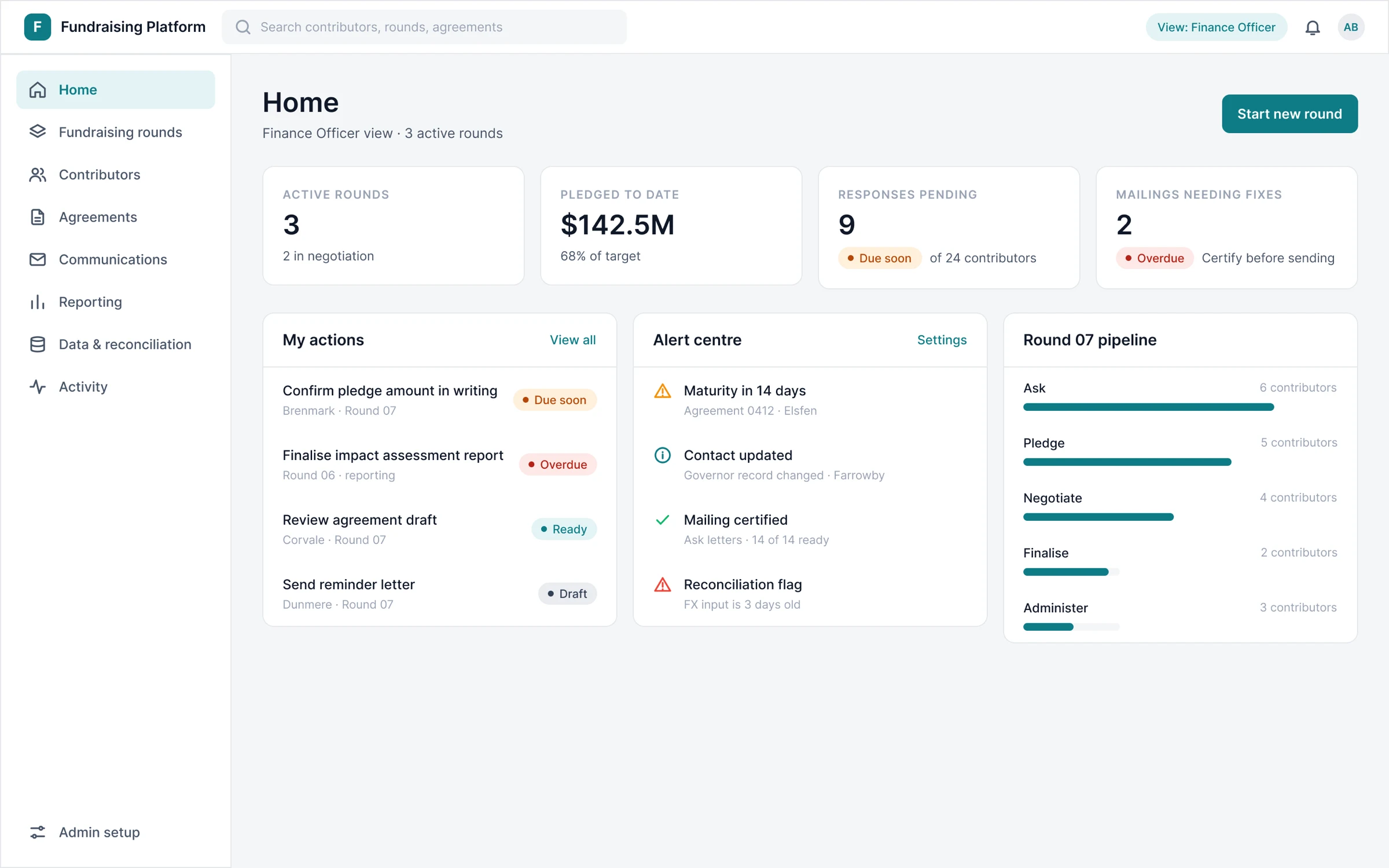
Home: my actions, alerts and the round pipeline, with emphasis set by role.
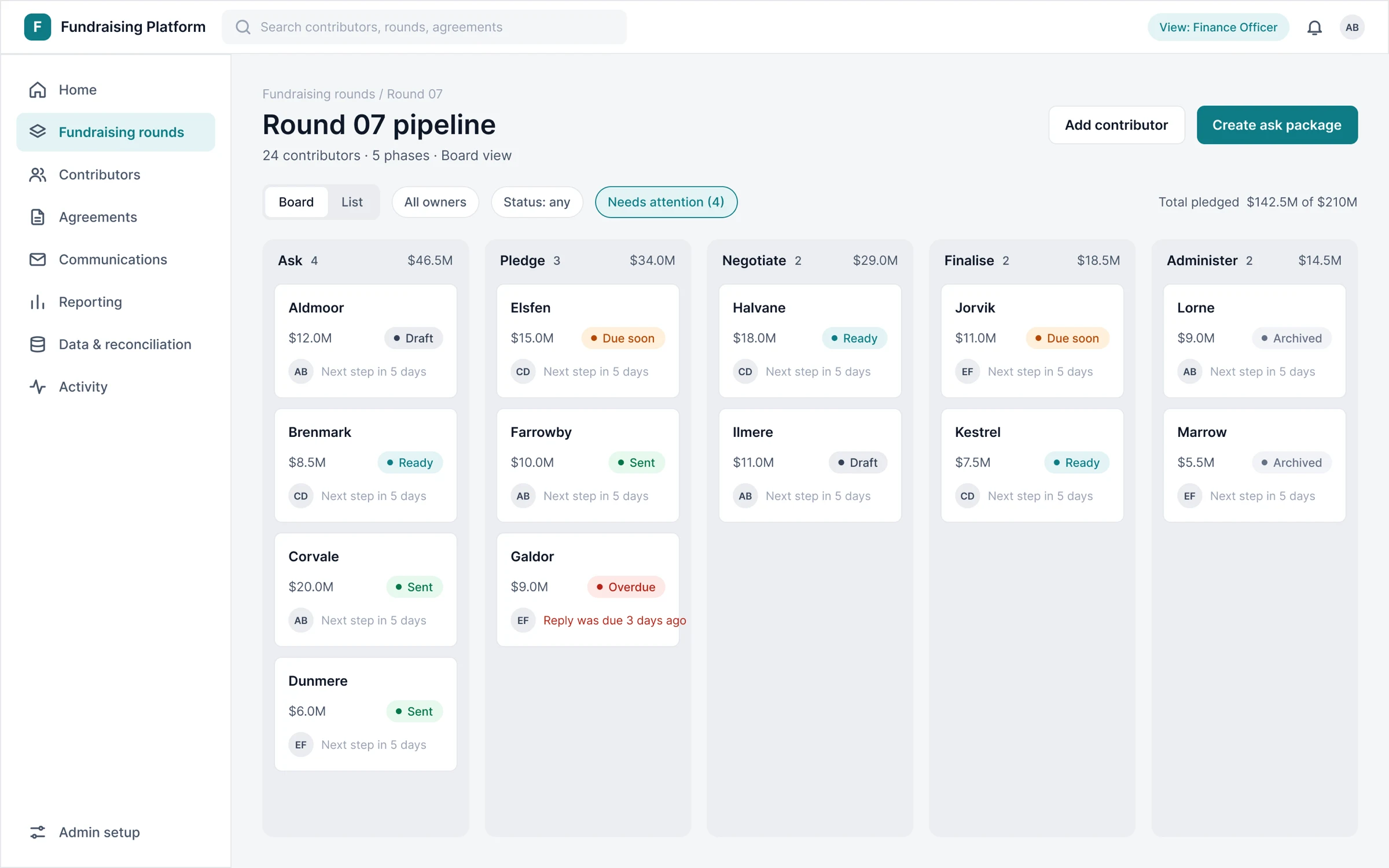
Pipeline board: five phases, a status on every card, an attention filter.
Case workspace
One place per contributor, so history no longer lives in someone's inbox.
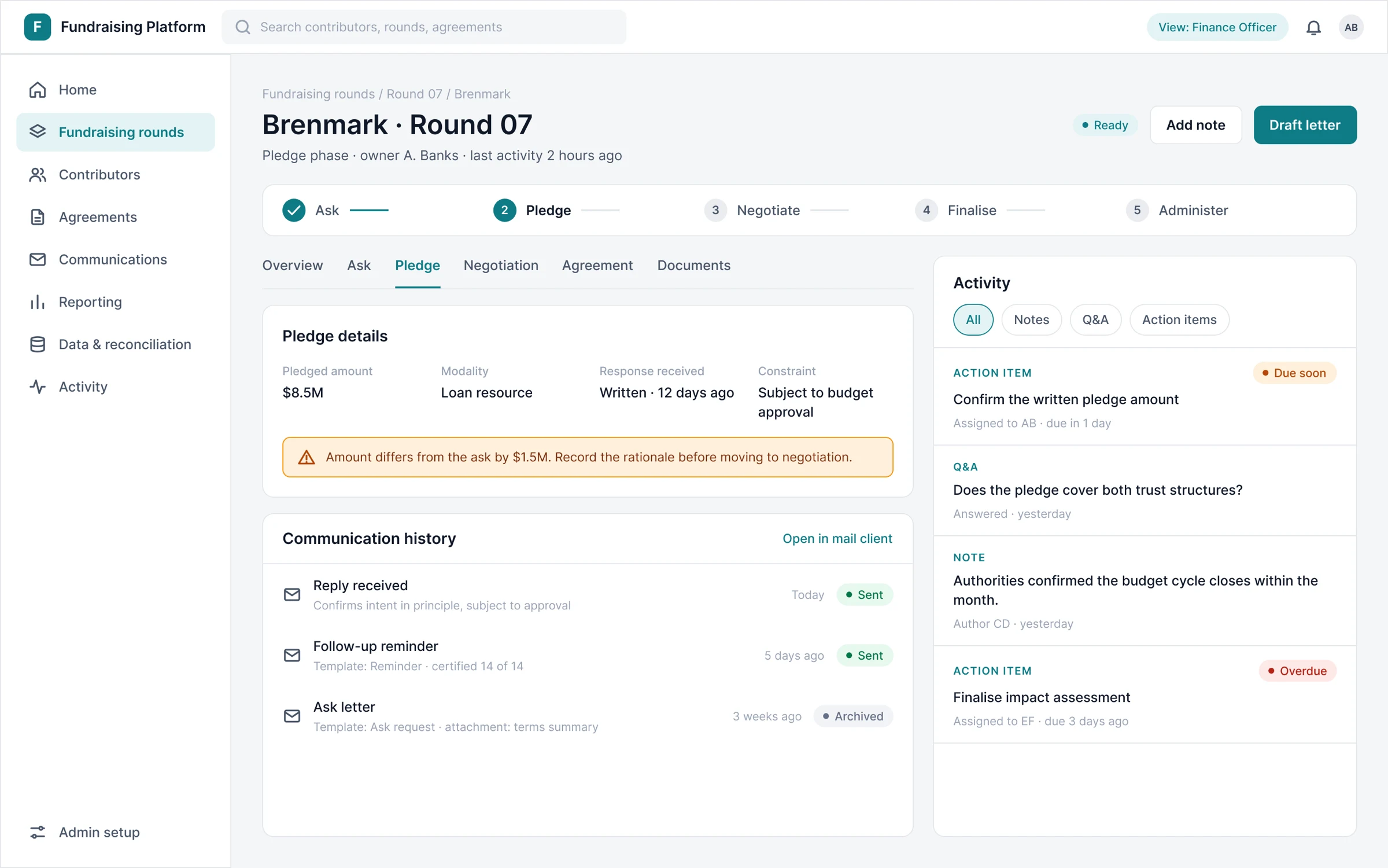
Case workspace: pledge record, communications and activity in one view.
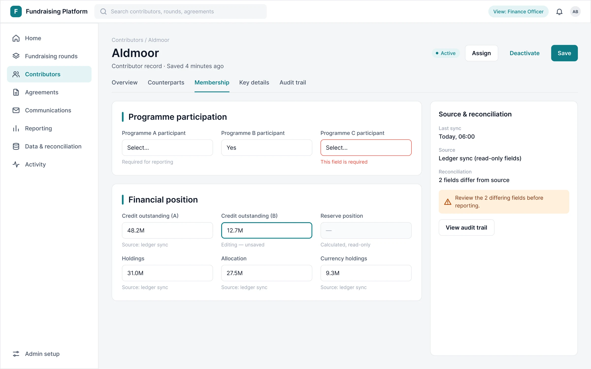
Contributor record: grouped sections, provenance and field states.
Ask package & certification
Automation drafts the work; a person certifies and sends it, and the irreversible step is deliberate.
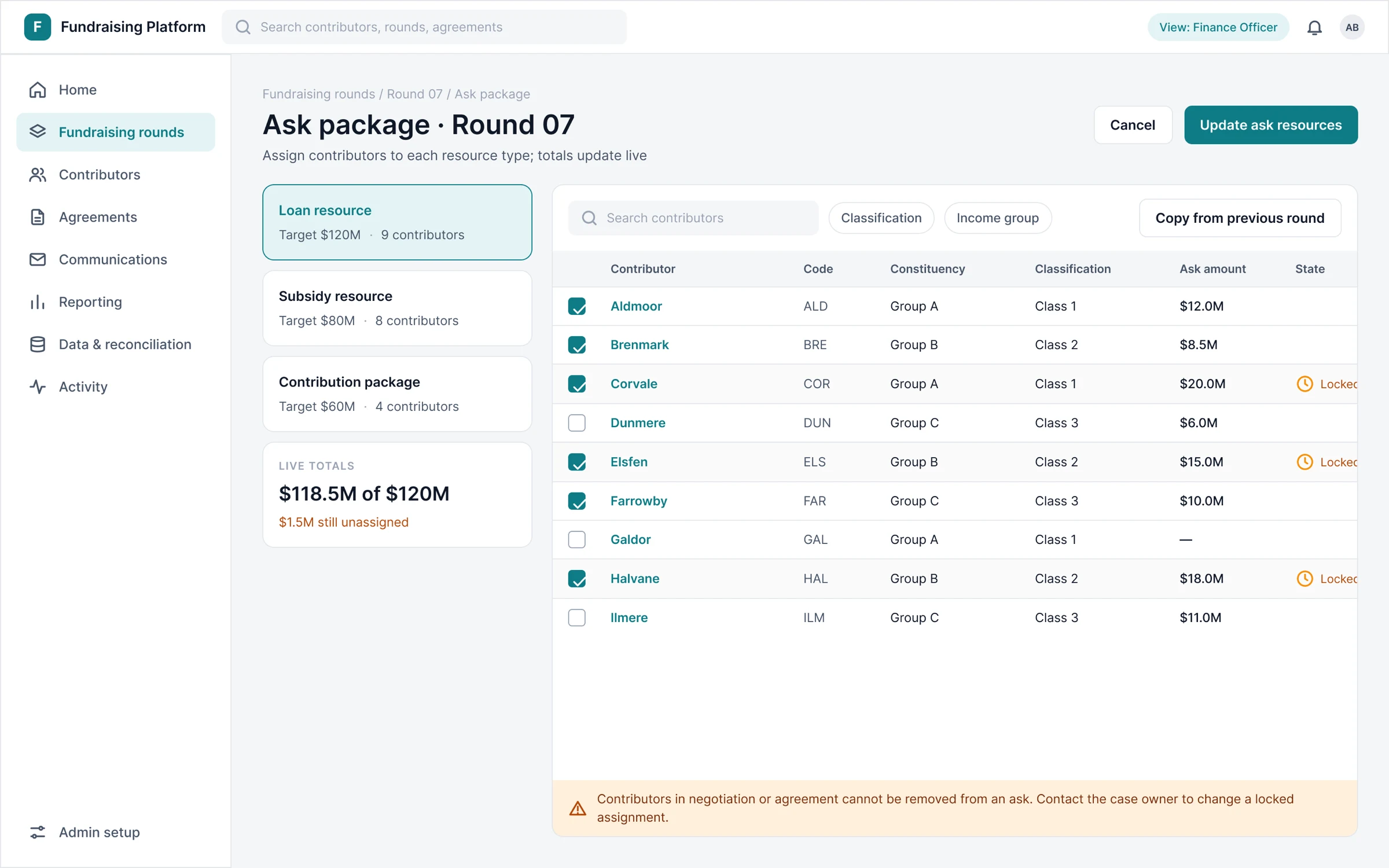
Ask package: live totals, and locked rows that say who can change them.
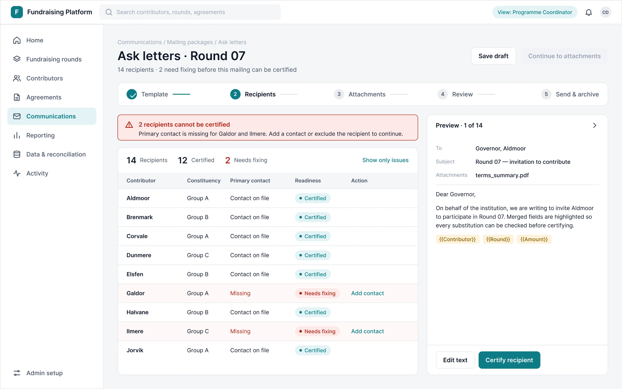
Error state: incomplete recipients block the next step and say why.
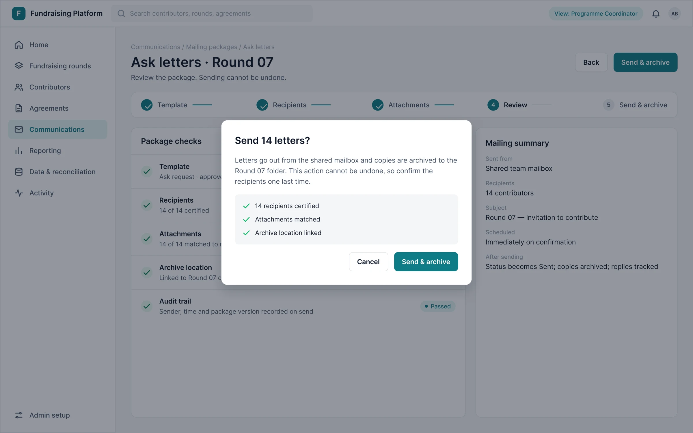
Review and send: a checklist and a confirmation for the step that cannot be undone.
Records, agreements & reporting
Long-lived obligations stay visible, and reports are generated from one dataset rather than rebuilt.
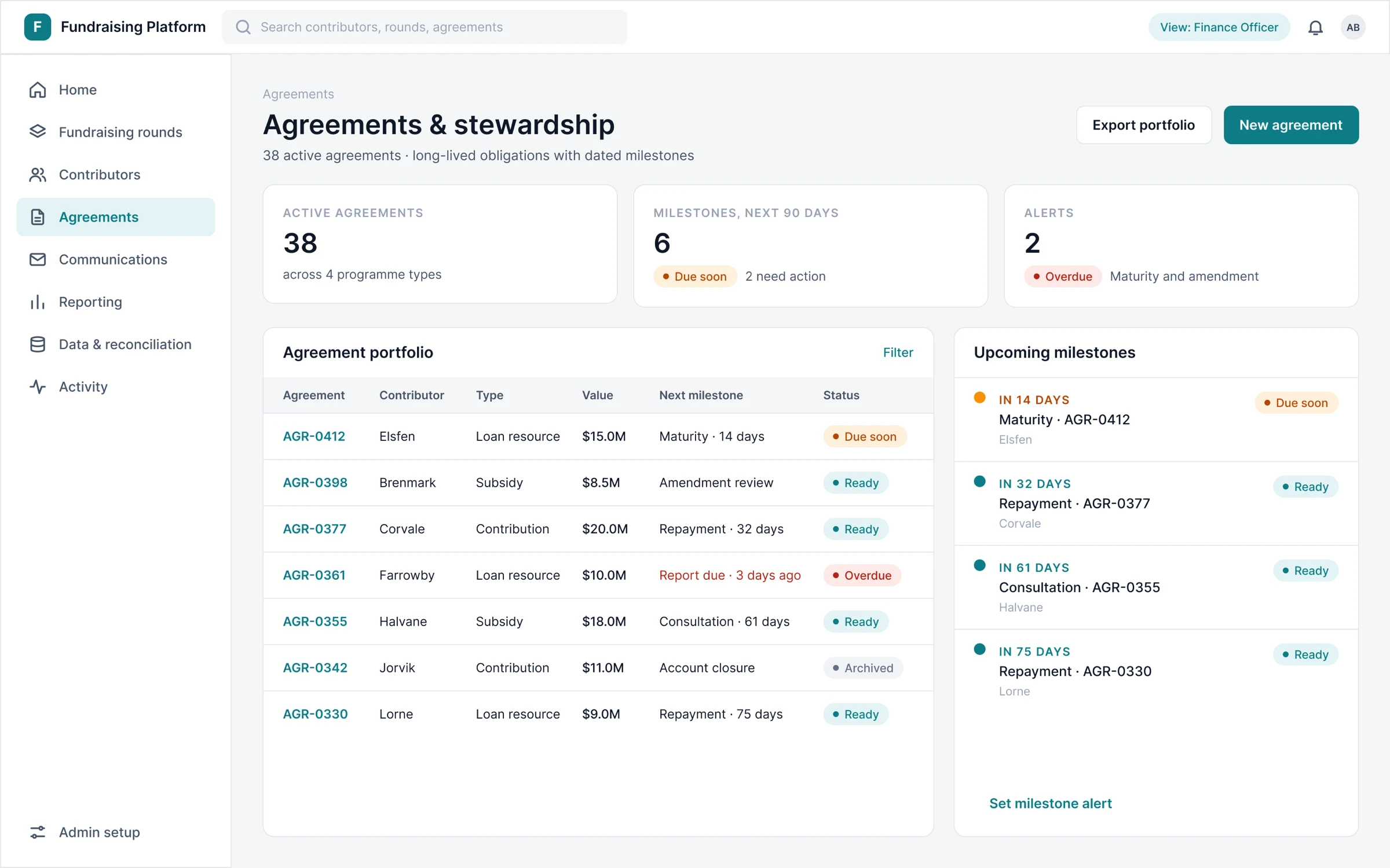
Agreements: dated milestones and alerts that stay visible for years.
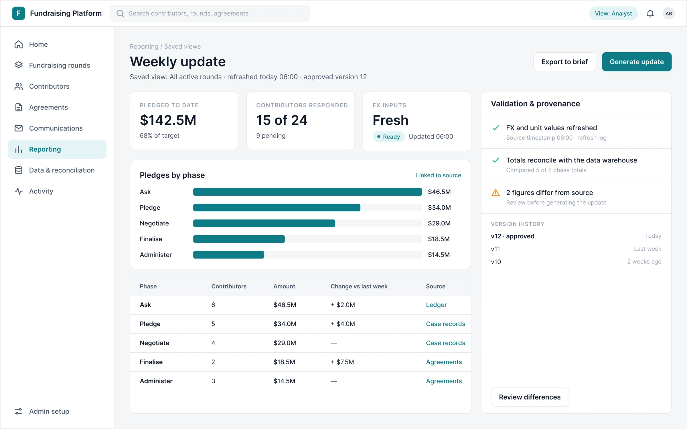
Weekly update: live-linked tables, validation and version history before export.
A quiet system for a high-stakes tool
The default low-code look read as a developer back end rather than an institutional application. I replaced it with a small, neutral house system: one typeface, one teal accent, and semantic colour reserved for status. Green, amber and red mean sent, due soon and blocking, and nothing else.
The default record form used almost one weight and one size, so titles, tabs, headings and labels read as the same level. A larger page title, section headings with an accent bar and medium-weight labels above fields make forms scan in three levels instead of one.
Where native forms and grids could not deliver the experience, I designed seven custom components, each tied to a research pain point. I used native components wherever they worked.
Foundations
Primary on white measures about 4.9:1, above the AA threshold for body text.
Seven custom components, each tied to research
Activity feed
One timeline of notes, questions and action items per contributor and round.
Action items
Owned, dated tasks with open, due soon and overdue states.
Notes
Free-form notes stamped with author and date, searchable later.
Knowledge base
Searchable contributor Q&A that suggests earlier replies.
Mail viewer
Recent contributor emails shown read-only, in context.
Mailing suite
Assemble, certify, send and archive, with checks at every step.
Ask package builder
Targets by resource type, assignments, live totals and guardrails.
What I handed over, and what is still to prove
What I can evidence is what I designed and handed over: the research set, a 30-template information architecture across four role views, the redesign of the low-code screens, seven custom components specified for the build, and a documented rationale for each structural change. Navigation moved from tables to tasks, the home screen from totals to actions, forms from flat to sectioned, and the send step became deliberate.
What I cannot yet claim is measured adoption or efficiency. The figures below are placeholders, not results.
Three things I would carry into the next project. Treat control as a feature: automation earned trust only when it showed its work. Design inside the platform first. And name things after tasks, because that one change reshaped navigation, home and reporting together.