

Four internal tools,
one shared system
one shared system
I redesigned and built the front end of four internal tools for a global engineering and consulting firm, and gave them a shared design system so they read as one workplace suite.

Overview
Over an 11-month engagement for a global engineering and consulting firm, I worked on its internal tools through the consultancy WongDoody, as an individual contributor covering both design and front-end development.
This case study covers four of those tools and the design system under them. Every tool sits inside the firm's intranet, is desktop-first, and is used because the job requires it. That shaped most decisions: calm layouts, one primary action per view, and status that never depends on colour alone.
The client, people and data are anonymised. The screens were rebuilt for the portfolio in a neutral style with invented names and figures; they are not screenshots of the originals.
Four tools, one suite
| Tool | Who uses it | Core job |
|---|---|---|
| Stakeholder engagement | Programme and regional leads | Log meetings with senior stakeholders and follow up the actions |
| Approval profiles | Compliance administrators | Define who approves which request, up to what amount |
| Conference management | Employees, managers, approvers, admins | Find a conference, request to attend, submit work, get approval |
| Field equipment reservation | Project staff, catalog admins | Request shared equipment, check availability, see the cost |
Stakeholder engagement
Leads log meetings with senior stakeholders, classed L1 to L6, and track the actions that come out of them. A programme lead sees every region; a regional lead sees their own. In my review of the original, cards were slow to scan, the create form permanently took a third of the page, applied filters were invisible, and task status relied on colour alone. These are design-review findings, not user research.
I kept the four-tab structure and the role-based quick filters, and changed how each view is laid out and how state is shown.
What changed
Dense and colour-coded
- Create form fixed in a right column, always on screen
- Cards stacked five or six label-and-value lines
- Task status shown by chip colour only
- Applied filters not visible
- Only the happy path designed
Full-width and explicit
- Create form opens on demand as a slide-over
- Card: title, stakeholder, level tag, four facts, one action
- Status tag with a dot and a word; holds up in colour-vision simulation
- Grouped filters drawer with an active count
- Loading, empty, no-results and error states added
Key screens
Rebuilt with invented data.
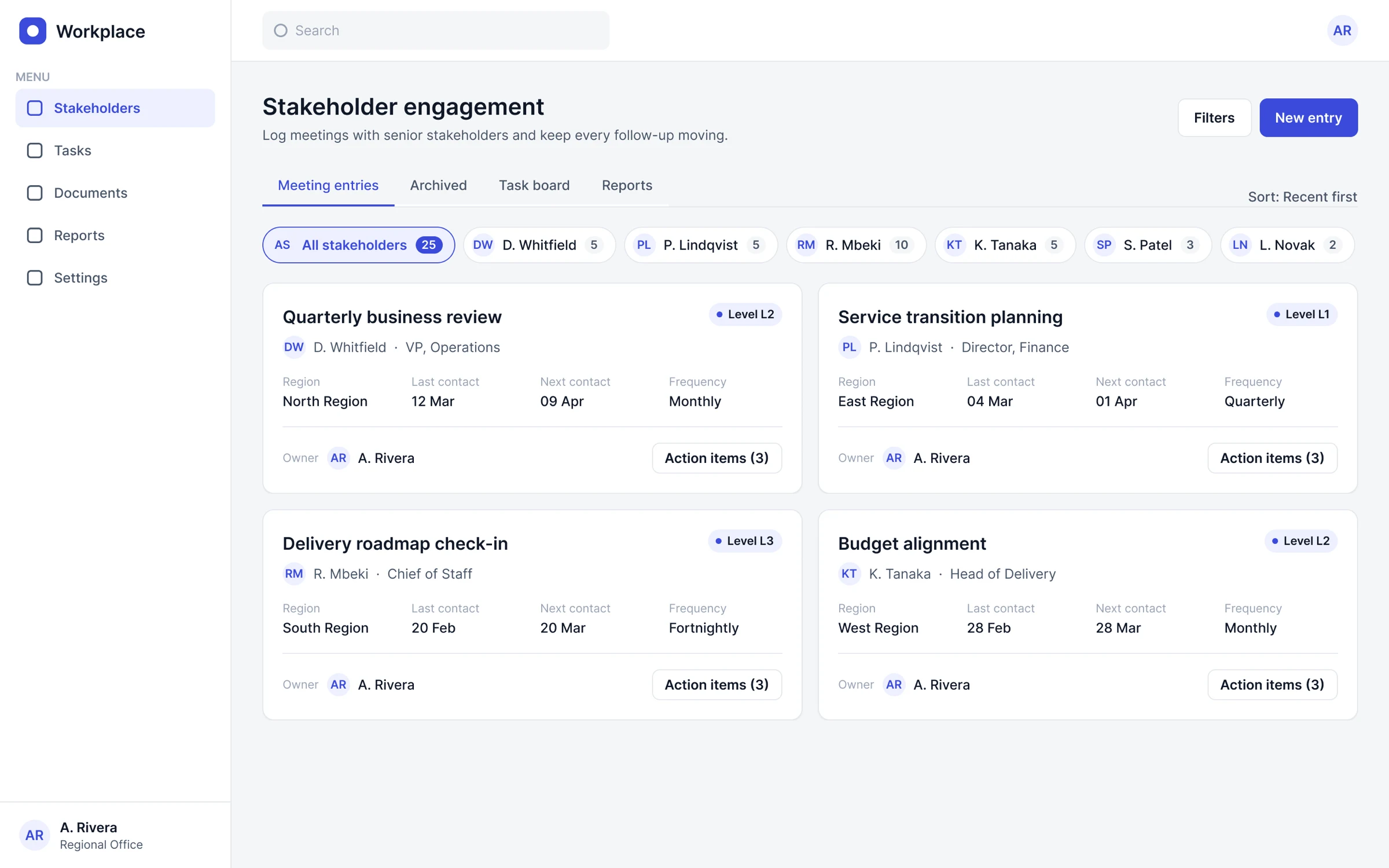
Meeting entries: full-width list with a role-based quick-filter strip.
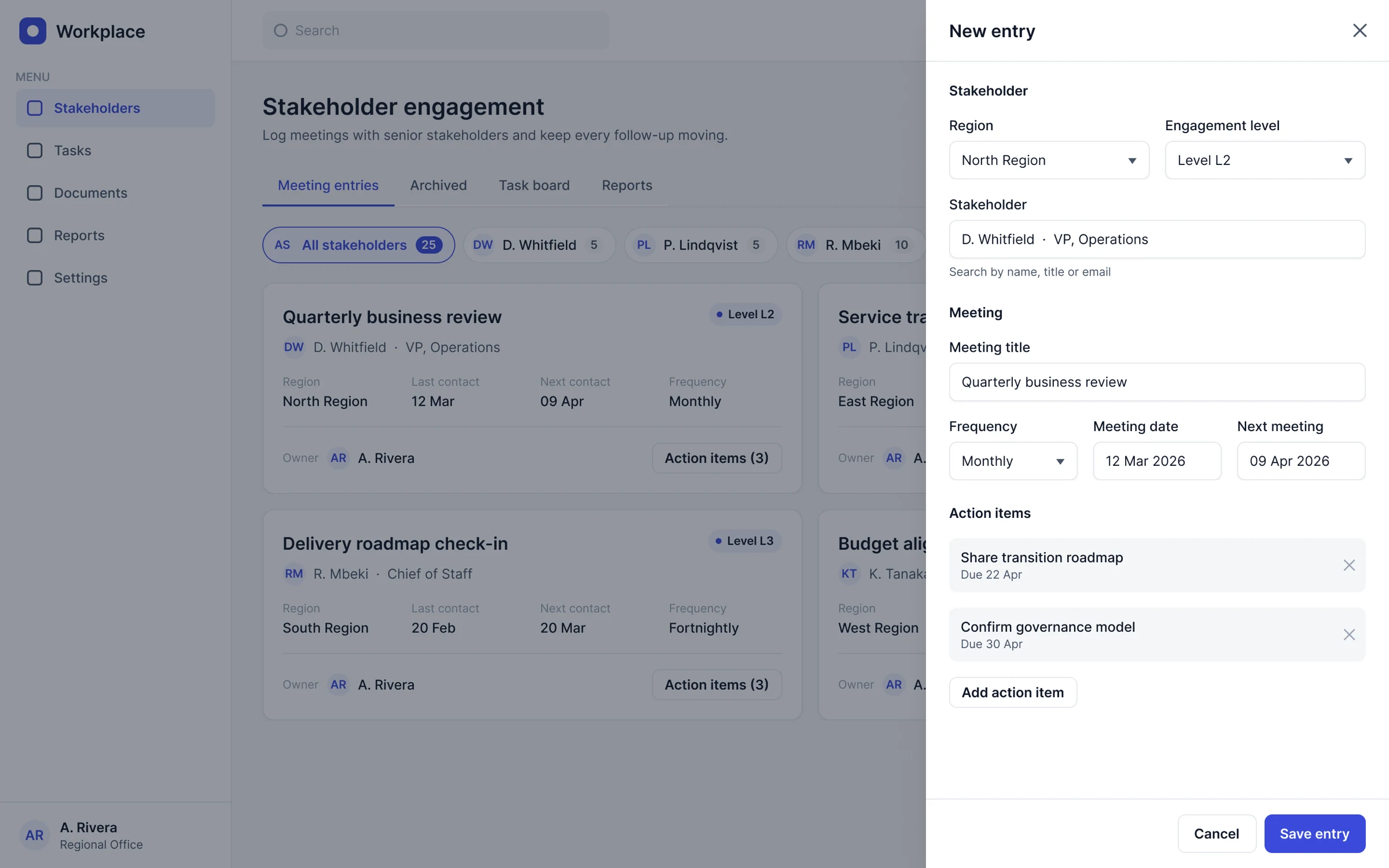
New entry as a slide-over: one focused task, list stays in context.
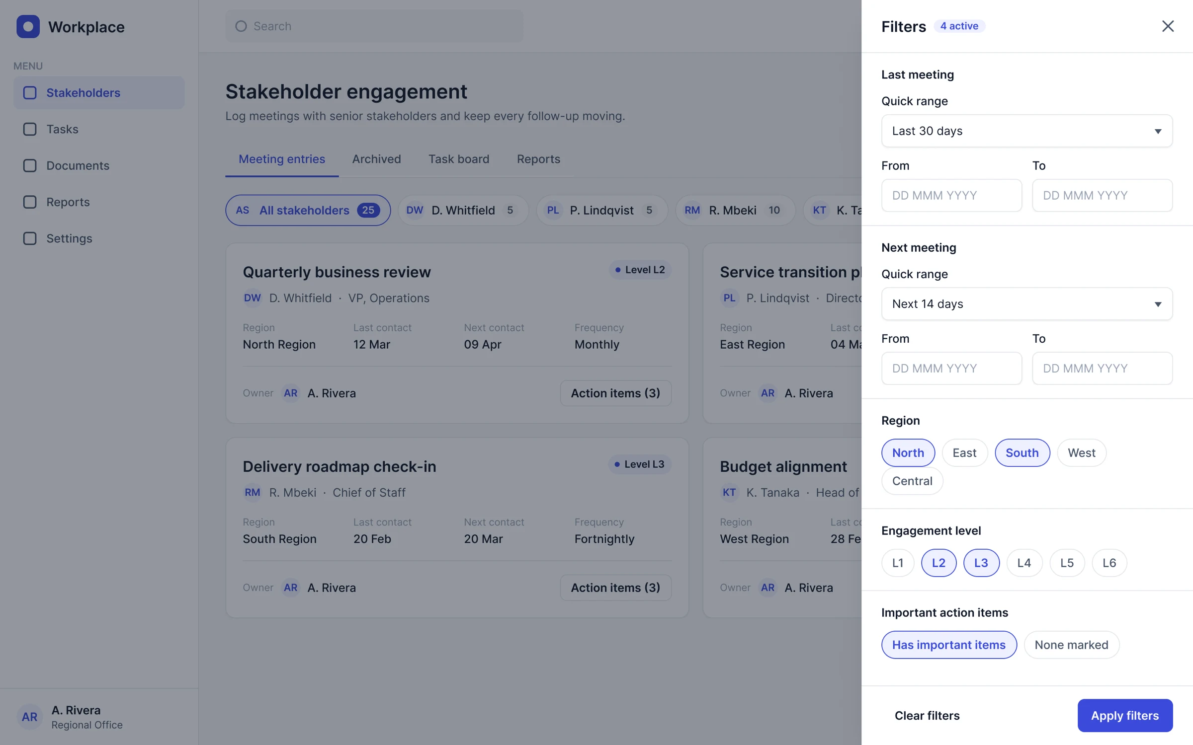
Filters drawer: grouped, with an active count.
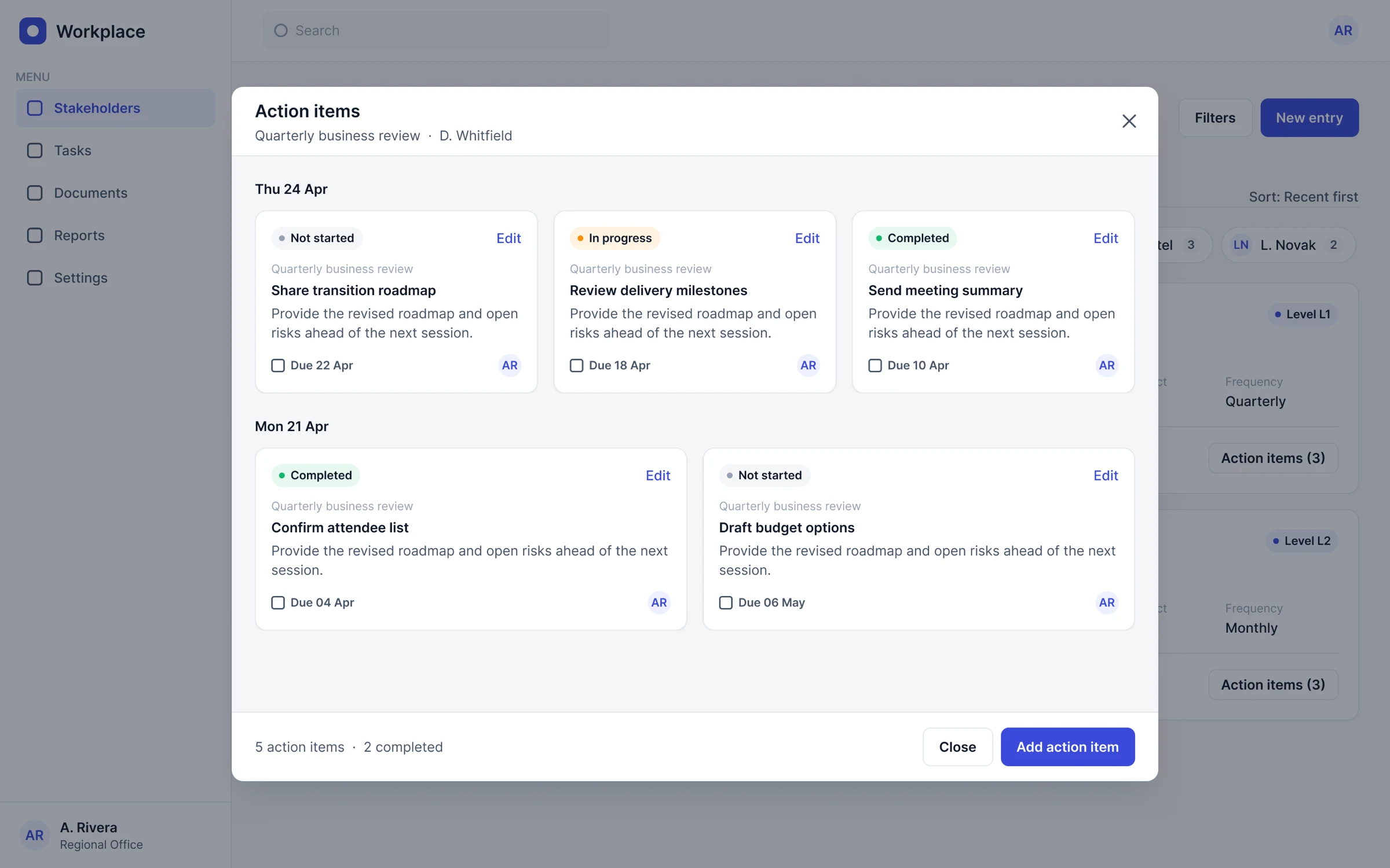
Action items: one step from the card, grouped by date.
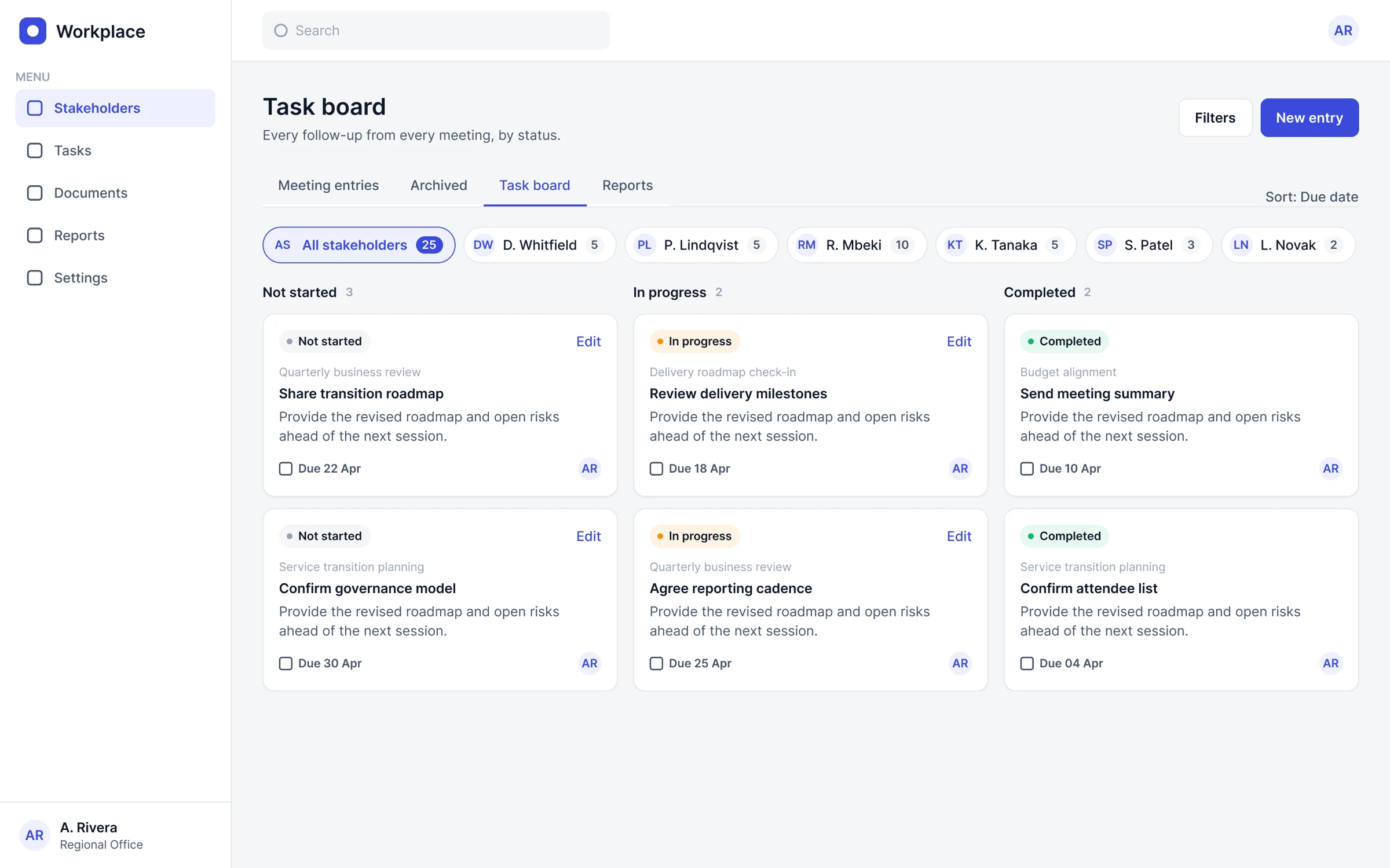
Task board: status as a word, not a colour.
Approval profiles
The admin side of a compliance workflow for gifts, hospitality and contribution requests. A profile combines up to eight scope dimensions, per-category limits and an ordered chain of approvers. In the original, setup was one flat form, profiles only appeared after two required filters, and replacing a departing approver was a risky manual job.
I kept the information architecture and every rule, and changed how each task is structured and confirmed. A few ideas are untested proposals: the similar-profile hint, the acknowledgement checkbox and the usage counts.
What changed and why
| Original | Redesign | Why |
|---|---|---|
| One flat grid of eight dropdowns and radios, all at the same weight | Four numbered sections (scope, request type, limits, approvers) with a live plain-language summary | Admins think in where, what, how much and who; the summary catches mistakes before saving |
| Multi-selects opened as side overlays covering nearby fields | Anchored panel with search, count, clear and apply; selections become removable chips | Keeps context on screen and shows the selection without reopening |
| Approvers in a two-row cluster with a lone plus button | Ordered chain: step number, role, primary and backup, status, remove, add step | The chain is a sequence, so order and per-step actions must be visible |
| Profiles hidden until two filters were set | Profiles load by default; filters become chips with a count | Removes a step from the most common task |
| Swap approvers: four text instructions and a small warning below the fold | Three steps, a persistent warning, a docked action bar and a confirmation listing every affected profile | A permanent action needs the warning next to it and a clear picture of impact |
| Internal jargon and inconsistent product names | Plain language: category, direction, limit | Admins and requesters share one vocabulary |
Replace an approver
- Find current approverSearch by person
- Choose profilesSelect which profiles change
- Pick replacementPrimary or backup position
- Confirm impactEvery profile and position listed
- ReviewUpdated profiles shown
Key screens
Rebuilt with invented data.
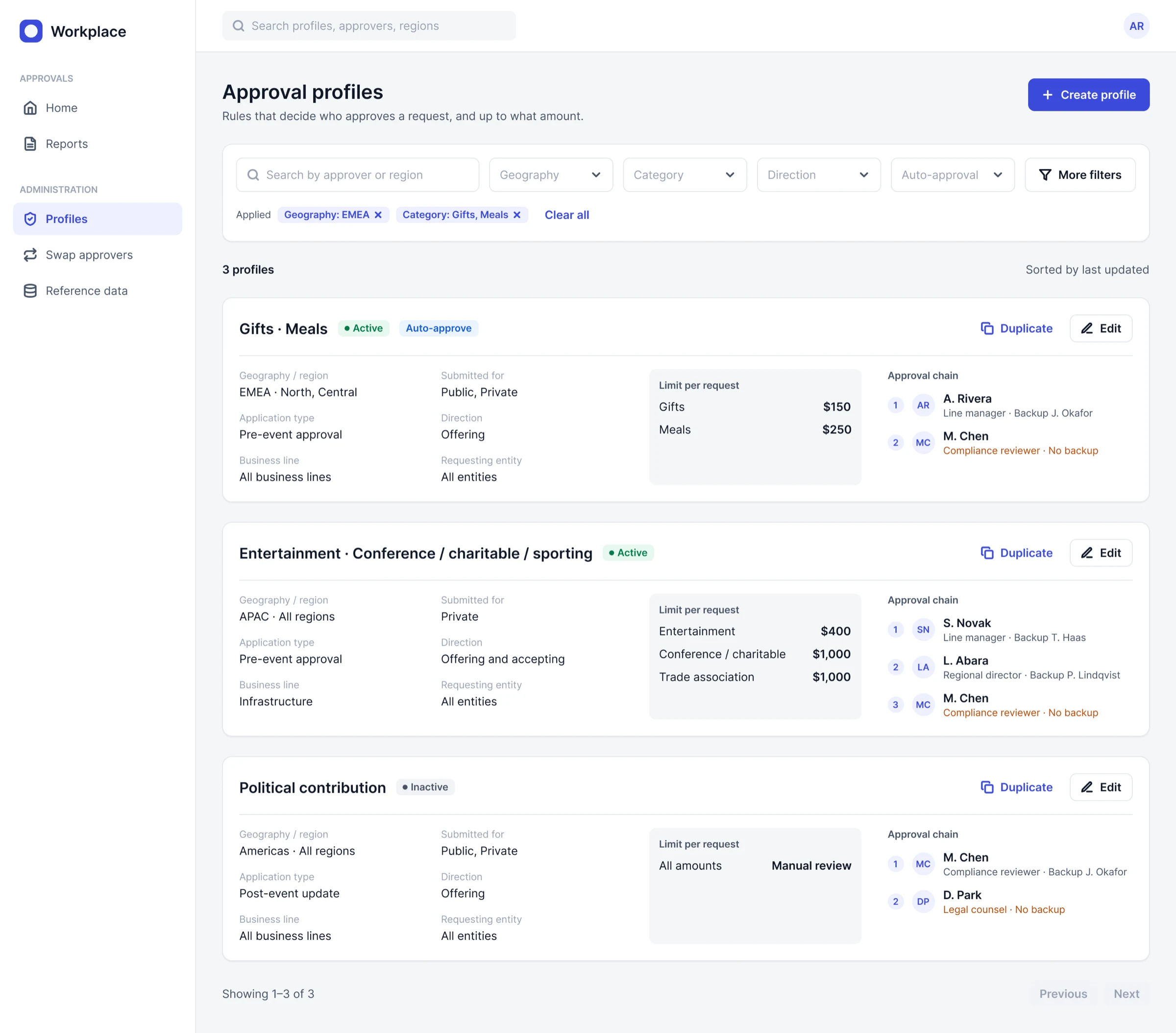
Profiles list: everything visible by default; filters are removable chips.
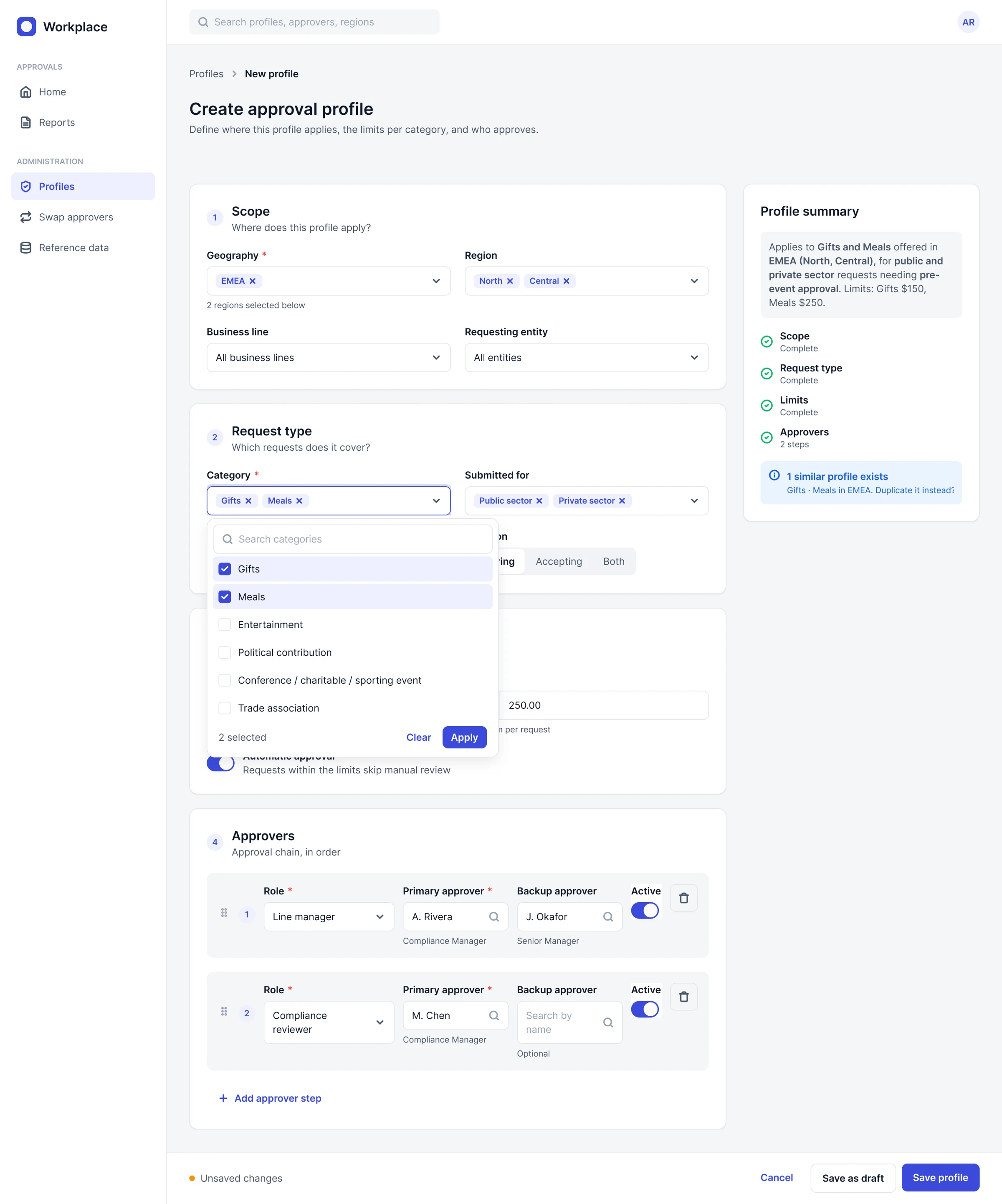
Create profile: four sections, an anchored category picker and a live summary.
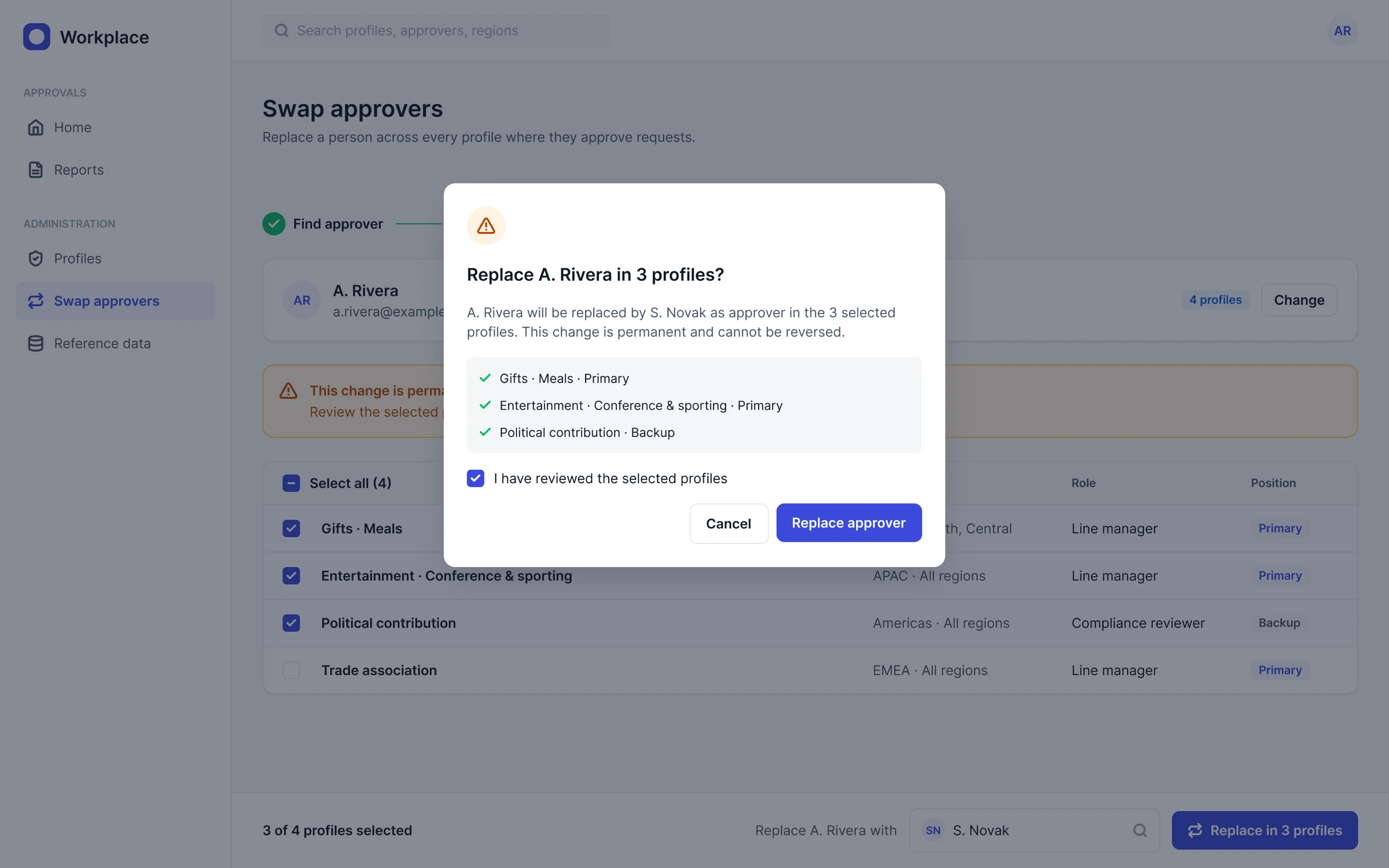
Swap approvers, confirm: exactly what will change before a permanent action.
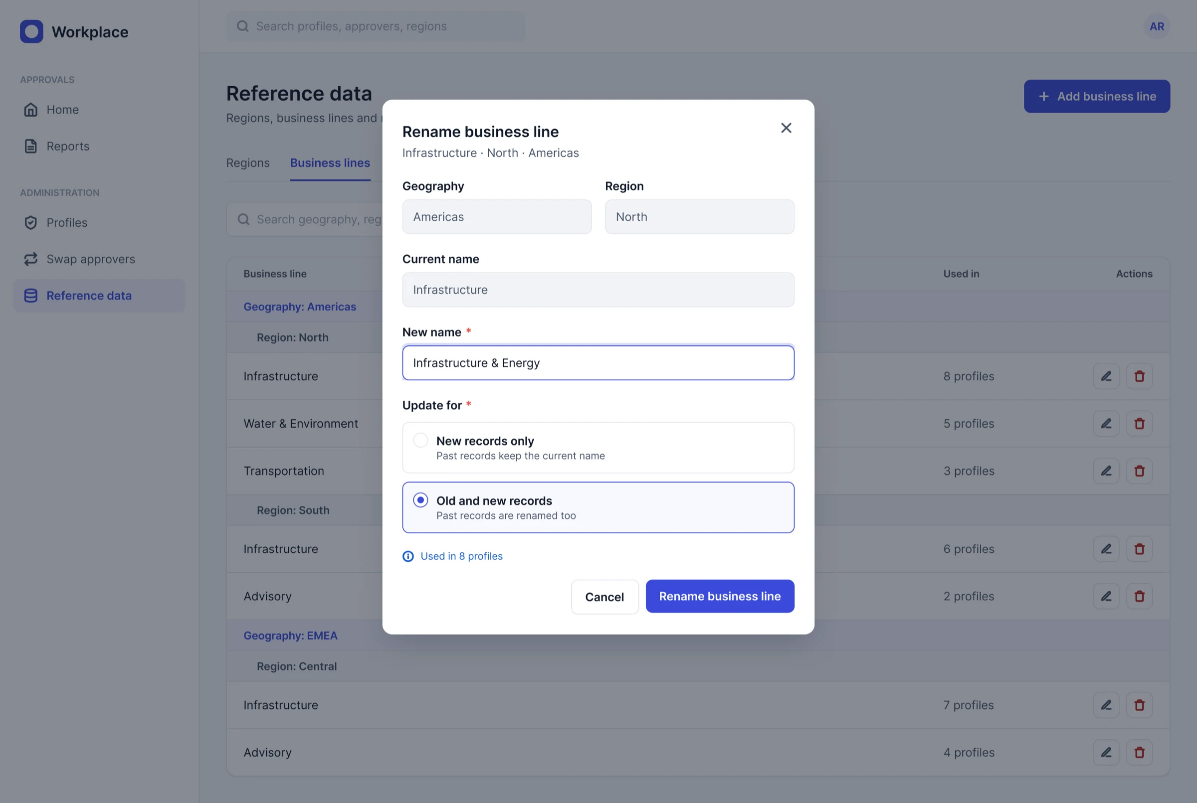
Reference data: grouped table; renaming asks whether past records change.
Conference management
One place to find a conference, request to attend, submit an abstract and later a paper, and get approvals from a manager, conference approvers and an abstract reviewer. Reviewing the original, I found one card shared by four roles, a five-step form crammed into a modal, the approval path shown only at the last step, and submissions locked with no visible reason. These are heuristic-review findings, not user research.
Roles, approval logic and file rules stayed the same. I changed layout, status language, forms and states.
What changed and why
| Area | Original | Redesign |
|---|---|---|
| Conference card | Photo background with four pills over the image | Text-first card with status, dates, place and a seats meter |
| My applications | Cards with coloured status text | Table with progress, one status chip and one next action; banner for anything waiting on you |
| Request flow | Five-step form in a modal | Focused page with a stepper, saved drafts, live summary and the approval path |
| Validation | Rules hidden in tooltips; no error states | Inline errors that say how to fix them, plus an error summary |
| Submissions | Paper rows locked with no reason given | Locked rows say when they unlock |
| Approver review | Modal over a card grid | List and detail side by side; conditions require a comment |
Application phases (unchanged logic)
- Request to attendManager approves, approves with conditions, or declines
- Abstract reviewApproved, conditional or declined
- Presentation or paperRequested automatically once the abstract is approved
- All approvedAttendance confirmed, email sent
Key screens
Rebuilt with invented data.
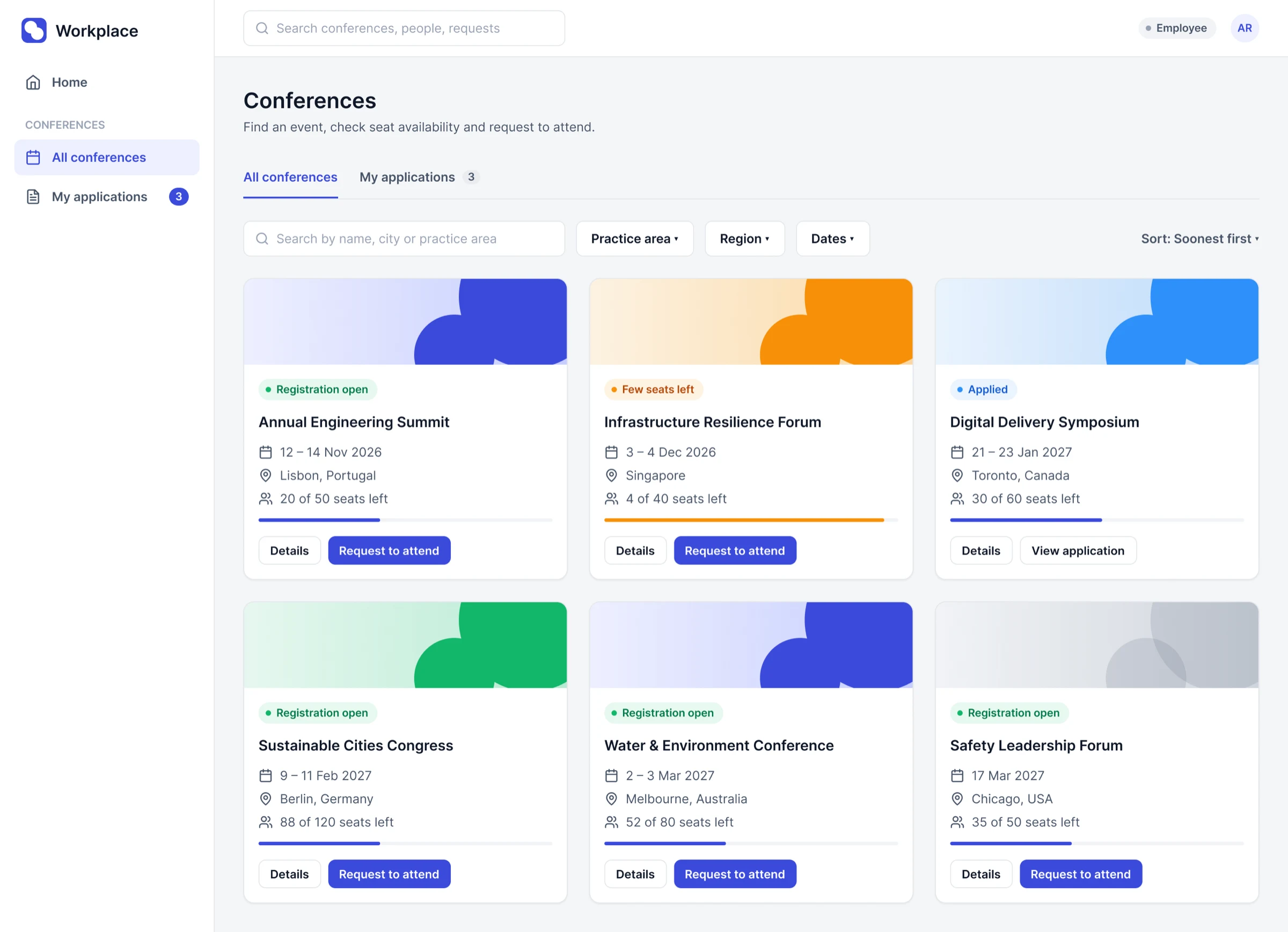
Browse: text-first cards with a seats meter.
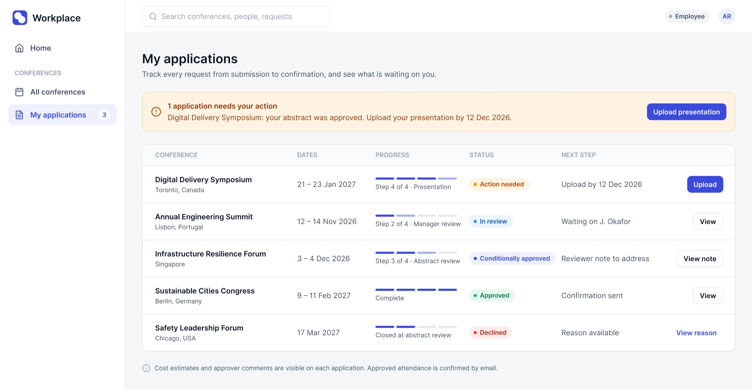
My applications: progress, status and one next action per row.
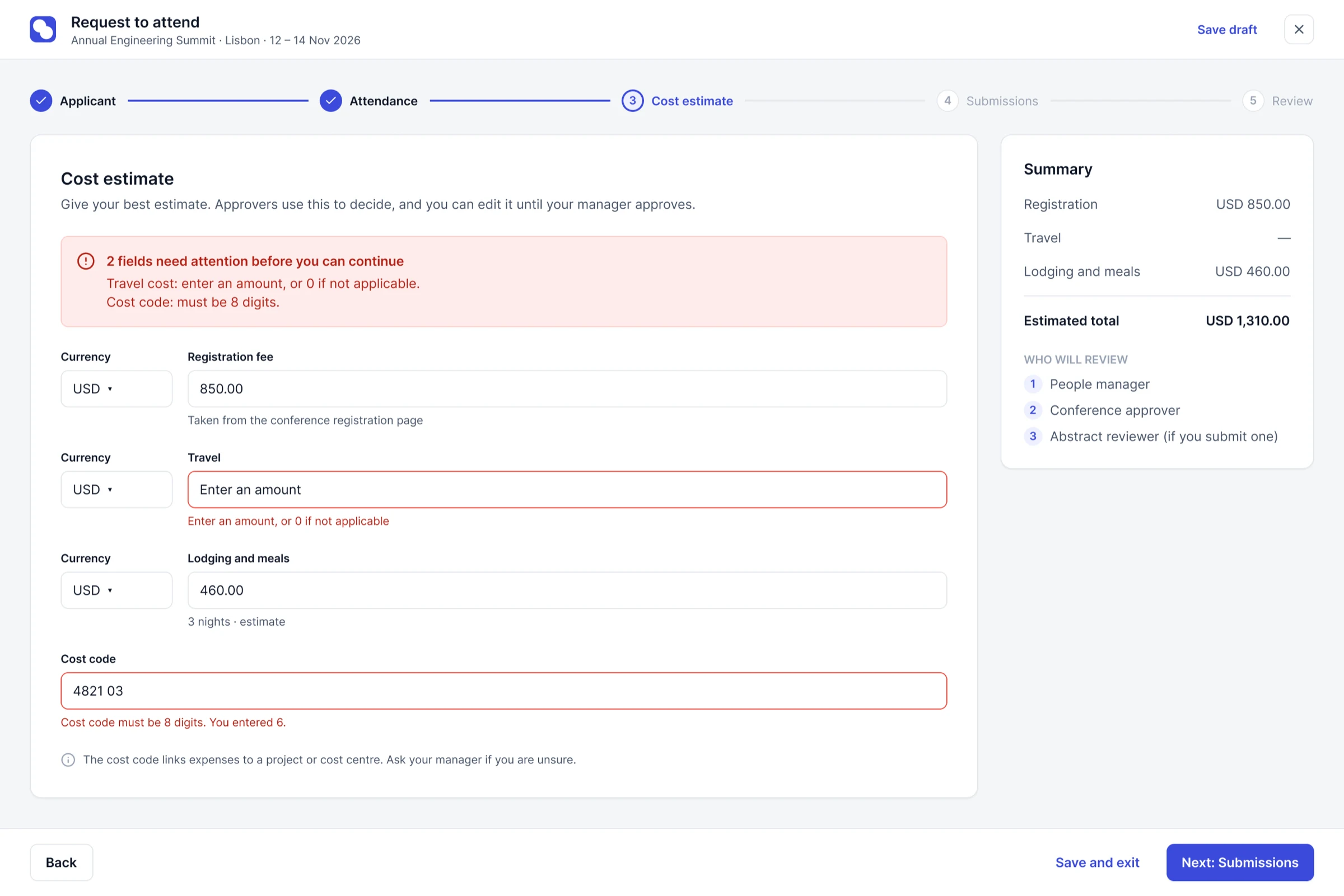
Request, cost step: inline errors, live total and the approval path.
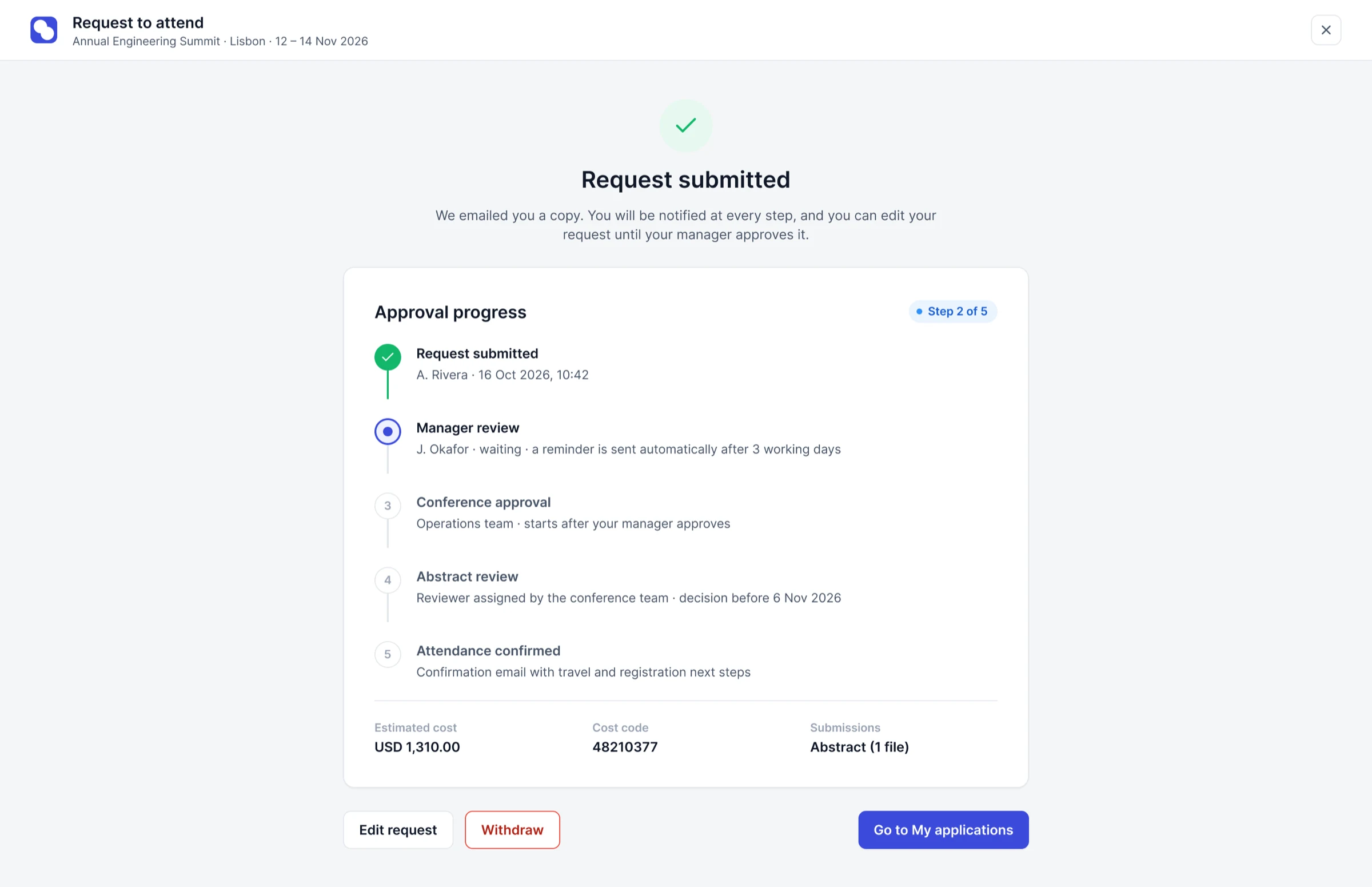
After submit: the approval path becomes a live tracker.
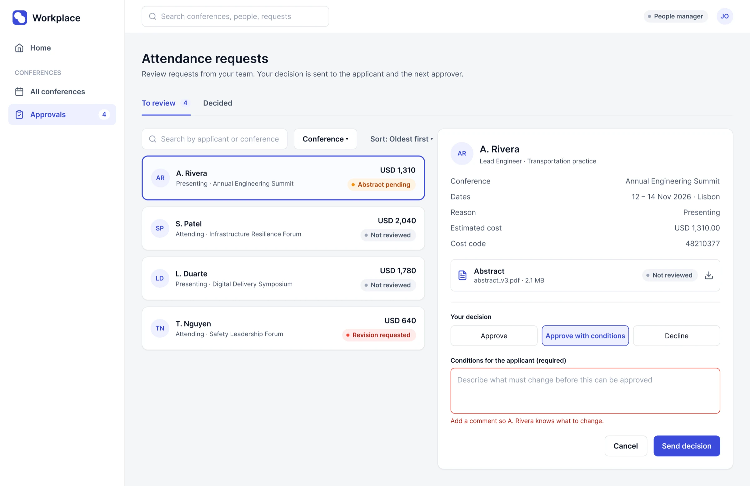
Approver review: conditions require a comment the applicant can act on.
Field equipment reservation
Staff reserve shared field equipment (boats, vehicles, sampling and positioning kit) against a project. Before the tool, this lived in a multi-tab rate spreadsheet and a signed invoice. People worked out day, week and month periods by hand, the total could fail with an error value, and nobody could see what was free for their dates.
I replaced three number steppers with one date range, showed availability per day with a bar and a word, and kept the running tray, which was the strongest idea in the source. Suggesting training from the equipment chosen is a hypothesis, not a tested result.
I designed the request flow and the catalog, then the project moved to another designer. To show the whole journey I designed the approval, pickup and return stages afterwards, based on evidence in the original files. Those screens are labelled, were never built and were never tested.
End-to-end journey
- RequestProject number fills the record
- AvailabilityPer day, for the project work window
- ReserveTray with live cost, then review and submit
- ApproveBudget, training and date checksPortfolio completion
- PickupScan tags, record condition, sign (mobile)Portfolio completion
- ReturnCheck in and flag damage (mobile)Portfolio completion
- ChargeNot designed by anyone: a known gap in the source
What changed and why
| Source | Redesign | Why |
|---|---|---|
| Months, weeks and days as three number steppers | One date range; duration and best rate computed | Removes mental arithmetic and ties availability to real dates |
| Units available, with no dates shown | Availability per day, defaulting to the work window | A count means nothing without its dates |
| Available, Reserved, Unavailable chips | Bar plus Available, Limited, Unavailable | Reserved and Unavailable overlapped; the bar shows what is left |
| Cost only at the end; error values possible | Per-line cost and a running total that cannot error | Fixes the failure found in the spreadsheet audit |
| Nine Yes or No training questions | Courses suggested from the equipment chosen | Keeps the safety check with fewer decisions (untested) |
| Delete confirm in the primary colour | Destructive style; past reservations keep their record | Destructive actions should look destructive |
Key screens
First three: my design, rebuilt with invented data. Last two: designed afterwards to complete the journey.
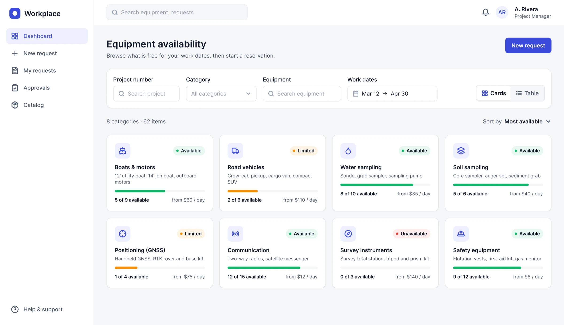
Dashboard: availability by category, with a bar and a word.
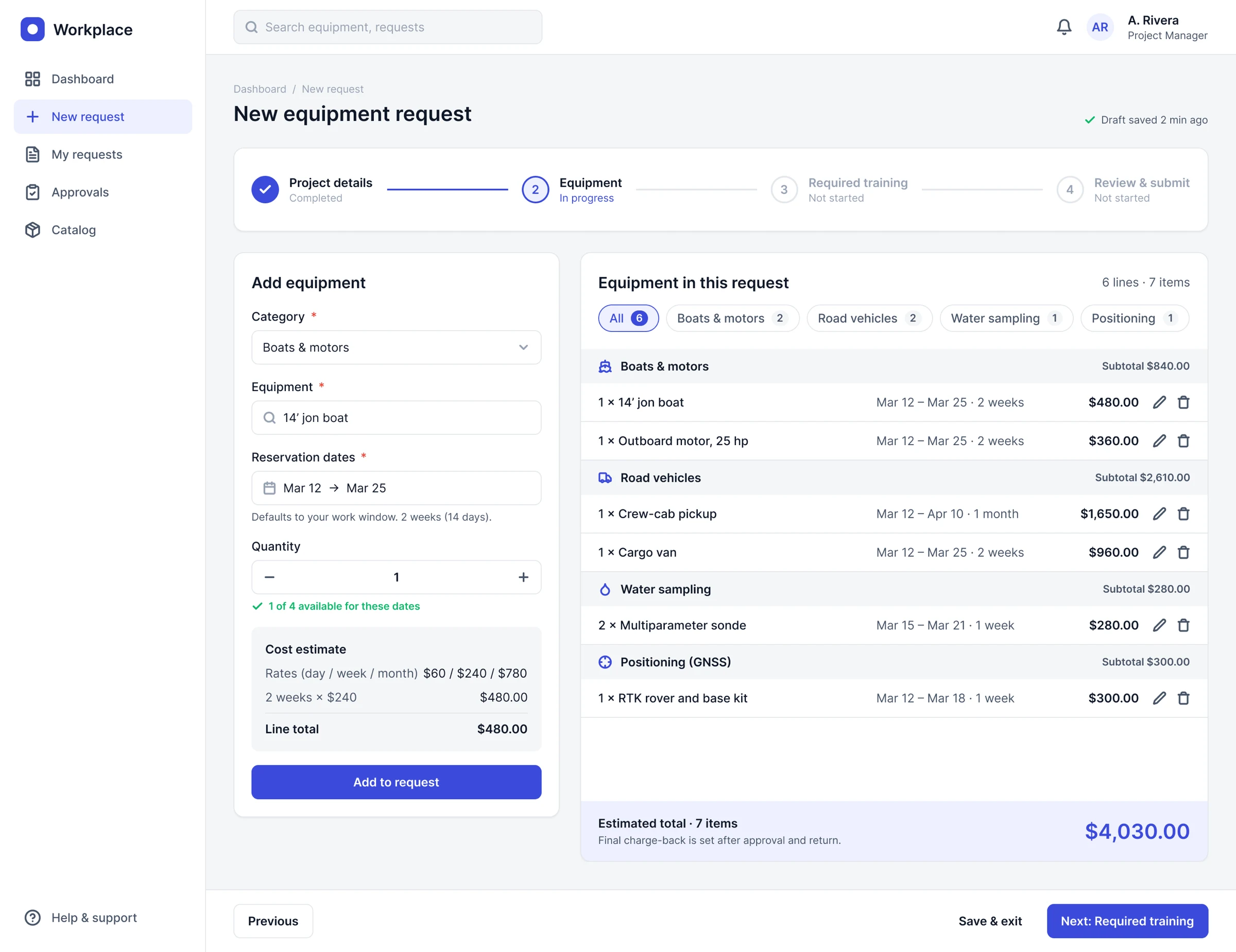
Request step 2: the tray keeps quantity, dates and cost together.
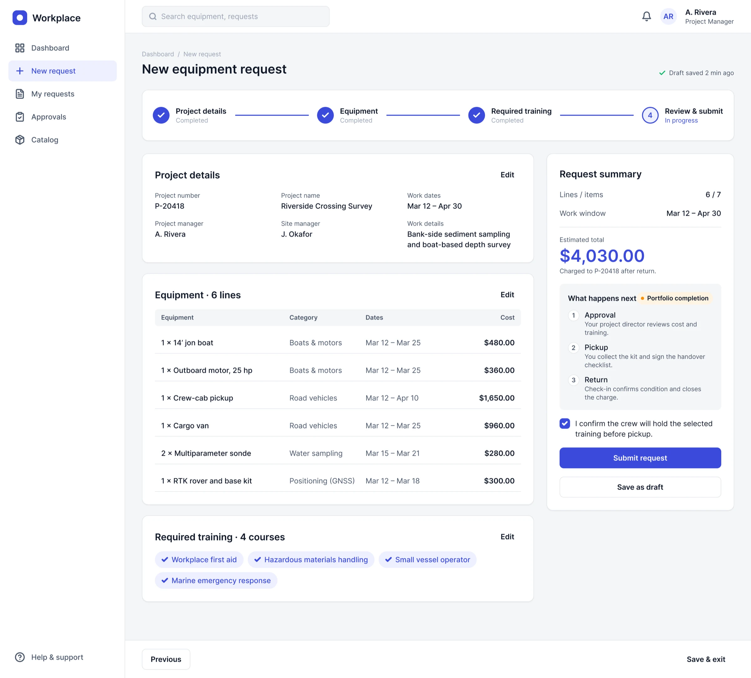
Request step 4: review and submit. The "What happens next" panel was added later.
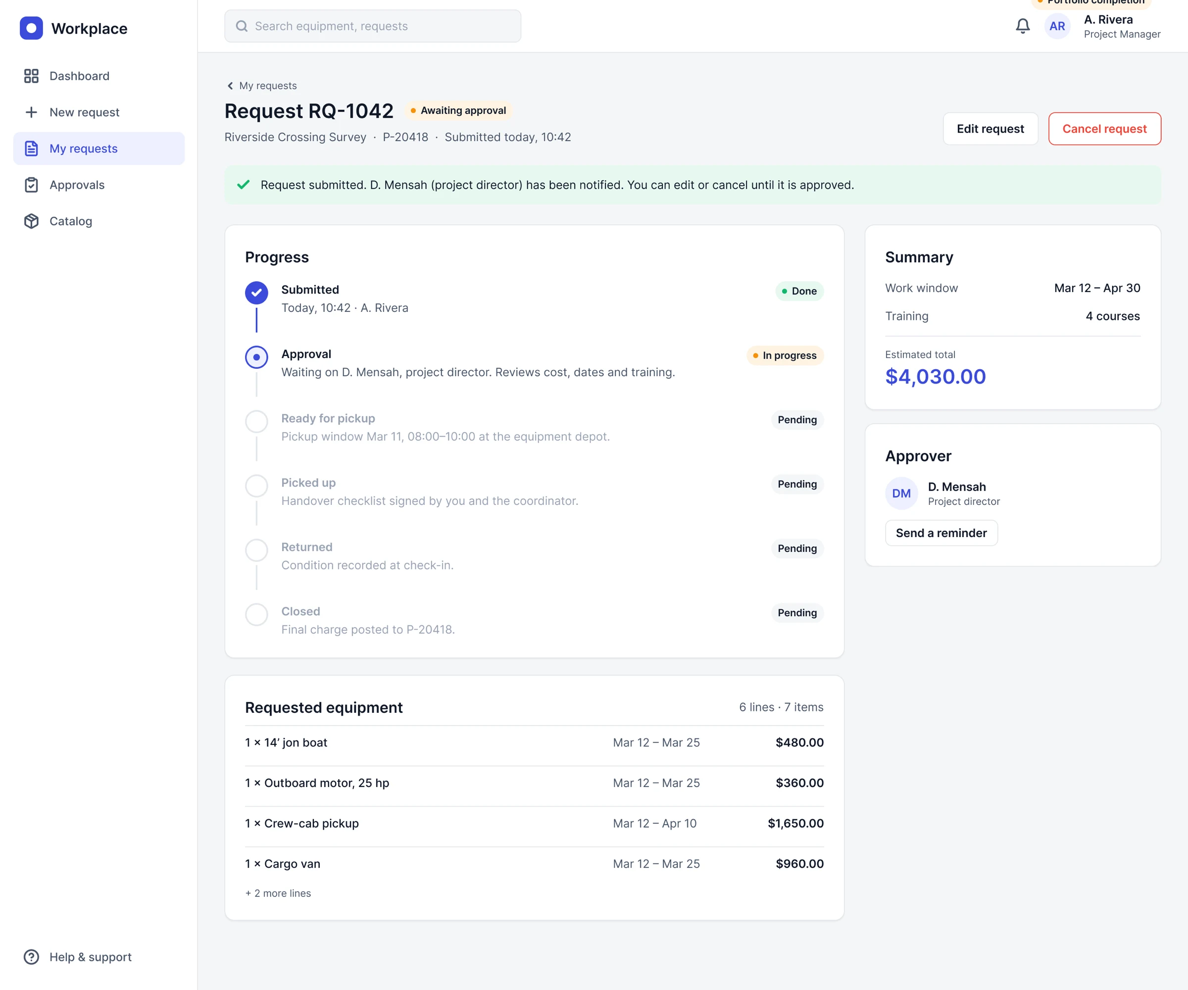
Portfolio completion — request status after submit. Never built or tested.
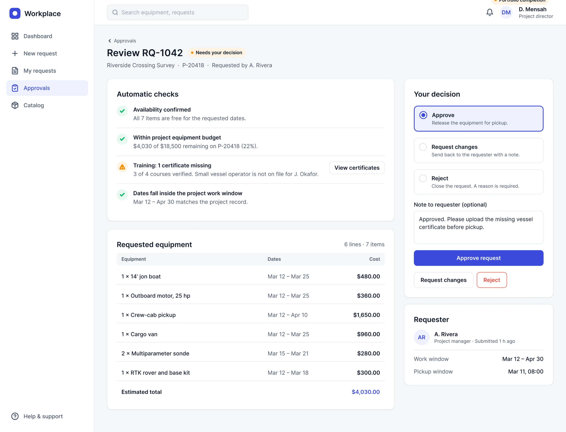
Portfolio completion — approver review and decision. Never built or tested.
Design system
The four tools live on separate platforms. I rebuilt the language they share as one neutral system so they read as one workplace suite: a 4pt grid, radius 8 on controls and 12 on cards, white surfaces on a light canvas, and one accent.
Seventeen primitive colours feed 18 semantic tokens, alongside space, radius and size variables, eight Inter text styles and four effect styles. Each variable carries its code syntax, so Figma and the front-end CSS use the same names. Rules that did most of the work: one primary button per view, status always carries a word, and every list is designed for empty, loading, error and populated states. There is no dark mode or data-visualisation palette yet.
Foundations
Primitive colours, as defined in the variables. Semantic tokens such as color/primary/default alias these.
Tokens
| Group | Values |
|---|---|
| Space (4pt grid) | 4, 8, 12, 16, 20, 24, 32, 40, 48, 64 |
| Radius | 8 control · 12 card · 999 pill |
| Size | 240 nav width · 64 top bar · 40 control height |
| Effects | Shadow sm, md, overlay · Focus ring |
The system in numbers
Outcome and reflection
I have no measured results for this work, so I am not claiming any. What it delivered: rebuilt screens for four tools covering default, validation, error, success and empty states; a shared system of variables, styles and 18 components; and front-end implementation across the engagement. The figures below are placeholders only.
Three things I take from it. Structure beat density: grouping the same fields by how people think made long forms easier to scan without dropping a rule. Status needs a word. And availability should be driven by dates, not counts.